Nota
L'accesso a questa pagina richiede l'autorizzazione. È possibile provare ad accedere o modificare le directory.
L'accesso a questa pagina richiede l'autorizzazione. È possibile provare a modificare le directory.
Questa esercitazione presenta un esempio end-to-end di un flusso di lavoro di data science Synapse in Microsoft Fabric. Usa R per analizzare e visualizzare i prezzi dell’avocado negli Stati Uniti, per compilare un modello di apprendimento automatico che preveda i prezzi futuri dell'avocado.
Questa esercitazione comprende i seguenti passaggi:
- Caricare le librerie predefinite
- Caricare i dati
- Personalizzare i dati
- Aggiungere nuovi pacchetti alla sessione
- Analizzare e visualizzare i dati
- Eseguire il training del modello

Prerequisiti
Ottenere una sottoscrizione di Microsoft Fabric. In alternativa, iscriversi per ottenere una versione di valutazione di Microsoft Fabric gratuita.
Accedere a Microsoft Fabric.
Utilizza il selettore dell'esperienza nell'angolo in basso a sinistra della tua home page per passare a Fabric.
Aprire o creare un notebook. Per istruzioni, vedere Come usare i notebook di Microsoft Fabric.
Impostare l'opzione del linguaggio su SparkR (R) per modificare il linguaggio primario.
Collegare il notebook a un lakehouse. Sul lato sinistro, selezionare Aggiungi per aggiungere un lakehouse esistente o creare un lakehouse.
Carica librerie
Usa librerie dal runtime R predefinito:
library(tidyverse)
library(lubridate)
library(hms)
Caricare i dati
Leggi i prezzi degli avocado da un file .CSV scaricato da internet:
df <- read.csv('https://synapseaisolutionsa.blob.core.windows.net/public/AvocadoPrice/avocado.csv', header = TRUE)
head(df,5)
Manipolare i dati
Innanzitutto, assegna un nome facile alle colonne.
# To use lowercase
names(df) <- tolower(names(df))

# To use snake case
avocado <- df %>%
  rename("av_index" = "x",
         "average_price" = "averageprice",
         "total_volume" = "total.volume",
         "total_bags" = "total.bags",
         "amount_from_small_bags" = "small.bags",
         "amount_from_large_bags" = "large.bags",
         "amount_from_xlarge_bags" = "xlarge.bags")

# Rename codes
avocado2 <- avocado %>%
  rename("PLU4046" = "x4046",
         "PLU4225" = "x4225",
         "PLU4770" = "x4770")

head(avocado2,5)
Modifica i tipi di dati, rimuovi le colonne indesiderate e aggiungi il consumo totale:
# Convert data
avocado2$year = as.factor(avocado2$year)
avocado2$date = as.Date(avocado2$date)
avocado2$month  = factor(months(avocado2$date), levels = month.name)
avocado2$average_price =as.numeric(avocado2$average_price)
avocado2$PLU4046 = as.double(avocado2$PLU4046)
avocado2$PLU4225 = as.double(avocado2$PLU4225)
avocado2$PLU4770 = as.double(avocado2$PLU4770)
avocado2$amount_from_small_bags = as.numeric(avocado2$amount_from_small_bags)
avocado2$amount_from_large_bags = as.numeric(avocado2$amount_from_large_bags)
avocado2$amount_from_xlarge_bags = as.numeric(avocado2$amount_from_xlarge_bags)


# Remove unwanted columns
avocado2 <- avocado2 %>%
  select(-av_index,-total_volume, -total_bags)

# Calculate total consumption
avocado2 <- avocado2 %>%
  mutate(total_consumption = PLU4046 + PLU4225 + PLU4770 + amount_from_small_bags + amount_from_large_bags + amount_from_xlarge_bags)
Installare nuovi pacchetti
Usare l'installazione del pacchetto inline per aggiungere nuovi pacchetti alla sessione:
install.packages(c("repr","gridExtra","fpp2"))
Carica le librerie necessarie.
library(tidyverse)
library(knitr)
library(repr)
library(gridExtra)
library(data.table)
Analizzare e visualizzare i dati
Confronta i prezzi dell'avocado convenzionale (non biologico) per regione:
options(repr.plot.width = 10, repr.plot.height =10)
# filter(mydata, gear %in% c(4,5))
avocado2 %>%
  filter(region %in% c("PhoenixTucson","Houston","WestTexNewMexico","DallasFtWorth","LosAngeles","Denver","Roanoke","Seattle","Spokane","NewYork")) %>%
  filter(type == "conventional") %>%
  select(date, region, average_price) %>%
  ggplot(aes(x = reorder(region, -average_price, na.rm = T), y = average_price)) +
  geom_jitter(aes(colour = region, alpha = 0.5)) +
  geom_violin(outlier.shape = NA, alpha = 0.5, size = 1) +
  geom_hline(yintercept = 1.5, linetype = 2) +
  geom_hline(yintercept = 1, linetype = 2) +
  annotate("rect", xmin = "LosAngeles", xmax = "PhoenixTucson", ymin = -Inf, ymax = Inf, alpha = 0.2) +
  geom_text(x = "WestTexNewMexico", y = 2.5, label = "My top 5 cities!", hjust = 0.5) +
  stat_summary(fun = "mean") +
  labs(x = "US city",
       y = "Avocado prices",
       title = "Figure 1. Violin plot of nonorganic avocado prices",
       subtitle = "Visual aids: \n(1) Black dots are average prices of individual avocados by city \n     between January 2015 and March 2018. \n(2) The plot is ordered descendingly.\n(3) The body of the violin becomes fatter when data points increase.") +
  theme_classic() +
  theme(legend.position = "none",
        axis.text.x = element_text(angle = 25, vjust = 0.65),
        plot.title = element_text(face = "bold", size = 15)) +
  scale_y_continuous(lim = c(0, 3), breaks = seq(0, 3, 0.5))
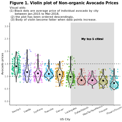
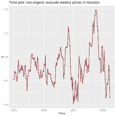
La regione di interesse è Houston.
library(fpp2)
conv_houston <- avocado2 %>%
  filter(region == "Houston",
         type == "conventional") %>%
  group_by(date) %>%
  summarise(average_price = mean(average_price))

# Set up ts

conv_houston_ts <- ts(conv_houston$average_price,
                 start = c(2015, 1),
                 frequency = 52)
# Plot

autoplot(conv_houston_ts) +
  labs(title = "Time plot: nonorganic avocado weekly prices in Houston",
       y = "$") +
  geom_point(colour = "brown", shape = 21) +
  geom_path(colour = "brown")
Eseguire il training di un modello di Machine Learning
Compila un modello di previsione dei prezzi per l'area di Houston, basato su ARIMA (modello autoregressivo integrato a media mobile):
conv_houston_ts_arima <- auto.arima(conv_houston_ts,
                                    d = 1,
                                    approximation = F,
                                    stepwise = F,
                                    trace = T)
checkresiduals(conv_houston_ts_arima)
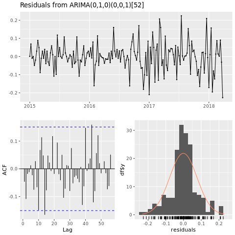
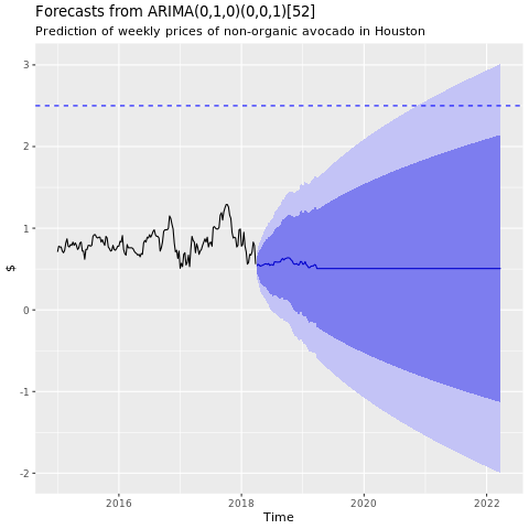
Grafico delle previsioni del modello ARIMA di Houston:
conv_houston_ts_arima_fc <- forecast(conv_houston_ts_arima, h = 208)

autoplot(conv_houston_ts_arima_fc) + labs(subtitle = "Prediction of weekly prices of nonorganic avocados in Houston",
       y = "$") +
  geom_hline(yintercept = 2.5, linetype = 2, colour = "blue")