이벤트
3월 31일 오후 11시 - 4월 2일 오후 11시
궁극적인 Microsoft Fabric, Power BI, SQL 및 AI 커뮤니티 주도 이벤트입니다. 2025년 3월 31일부터 4월 2일까지.
지금 등록이 자습서에서는 Microsoft Fabric에서 Synapse 데이터 과학 워크플로의 엔드투엔드 예시를 제공합니다. R을 사용하여 미국 아보카도 가격을 분석하고 시각화하여 미래의 아보카도 가격을 예측하는 기계 학습 모델을 구축합니다.
이 자습서에서는 다음과 같은 단계를 다룹니다.

Microsoft Fabric 구독을 구매합니다. 또는 무료 Microsoft Fabric 평가판에 등록합니다.
Microsoft Fabric에 로그인합니다.
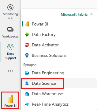
홈페이지 왼쪽의 환경 전환기를 사용하여 Synapse 데이터 과학 환경으로 전환합니다.
Notebook을 열거나 만듭니다. 방법을 알아보려면 Microsoft Fabric Notebook을 사용하는 방법을 참조하세요.
언어 옵션을 SparkR(R) 로 설정하여 기본 언어를 변경합니다.
레이크하우스에 Notebook을 첨부합니다. 왼쪽에서 추가를 선택하여 기존 레이크하우스를 추가하거나 레이크하우스를 만듭니다.
기본 R 런타임의 라이브러리를 사용합니다.
library(tidyverse)
library(lubridate)
library(hms)
에서 아보카도 가격을 읽어보십시오. 인터넷에서 다운로드한 CSV 파일:
df <- read.csv('https://synapseaisolutionsa.blob.core.windows.net/public/AvocadoPrice/avocado.csv', header = TRUE)
head(df,5)
먼저 열에 친숙한 이름을 지정합니다.
# To use lowercase
names(df) <- tolower(names(df))

# To use snake case
avocado <- df %>%
  rename("av_index" = "x",
         "average_price" = "averageprice",
         "total_volume" = "total.volume",
         "total_bags" = "total.bags",
         "amount_from_small_bags" = "small.bags",
         "amount_from_large_bags" = "large.bags",
         "amount_from_xlarge_bags" = "xlarge.bags")

# Rename codes
avocado2 <- avocado %>%
  rename("PLU4046" = "x4046",
         "PLU4225" = "x4225",
         "PLU4770" = "x4770")

head(avocado2,5)
데이터 형식을 변경하고, 원치 않는 열을 제거하고, 총 사용량을 추가합니다.
# Convert data
avocado2$year = as.factor(avocado2$year)
avocado2$date = as.Date(avocado2$date)
avocado2$month  = factor(months(avocado2$date), levels = month.name)
avocado2$average_price =as.numeric(avocado2$average_price)
avocado2$PLU4046 = as.double(avocado2$PLU4046)
avocado2$PLU4225 = as.double(avocado2$PLU4225)
avocado2$PLU4770 = as.double(avocado2$PLU4770)
avocado2$amount_from_small_bags = as.numeric(avocado2$amount_from_small_bags)
avocado2$amount_from_large_bags = as.numeric(avocado2$amount_from_large_bags)
avocado2$amount_from_xlarge_bags = as.numeric(avocado2$amount_from_xlarge_bags)


# Remove unwanted columns
avocado2 <- avocado2 %>%
  select(-av_index,-total_volume, -total_bags)

# Calculate total consumption
avocado2 <- avocado2 %>%
  mutate(total_consumption = PLU4046 + PLU4225 + PLU4770 + amount_from_small_bags + amount_from_large_bags + amount_from_xlarge_bags)
인라인 패키지 설치를 사용하여 세션에 새 패키지를 추가합니다.
install.packages(c("repr","gridExtra","fpp2"))
필요한 라이브러리를 로드합니다.
library(tidyverse)
library(knitr)
library(repr)
library(gridExtra)
library(data.table)
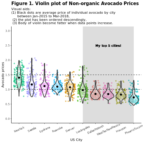
지역별로 기존의 (비조직) 아보카도 가격을 비교합니다.
options(repr.plot.width = 10, repr.plot.height =10)
# filter(mydata, gear %in% c(4,5))
avocado2 %>%
  filter(region %in% c("PhoenixTucson","Houston","WestTexNewMexico","DallasFtWorth","LosAngeles","Denver","Roanoke","Seattle","Spokane","NewYork")) %>%
  filter(type == "conventional") %>%
  select(date, region, average_price) %>%
  ggplot(aes(x = reorder(region, -average_price, na.rm = T), y = average_price)) +
  geom_jitter(aes(colour = region, alpha = 0.5)) +
  geom_violin(outlier.shape = NA, alpha = 0.5, size = 1) +
  geom_hline(yintercept = 1.5, linetype = 2) +
  geom_hline(yintercept = 1, linetype = 2) +
  annotate("rect", xmin = "LosAngeles", xmax = "PhoenixTucson", ymin = -Inf, ymax = Inf, alpha = 0.2) +
  geom_text(x = "WestTexNewMexico", y = 2.5, label = "My top 5 cities!", hjust = 0.5) +
  stat_summary(fun = "mean") +
  labs(x = "US city",
       y = "Avocado prices",
       title = "Figure 1. Violin plot of nonorganic avocado prices",
       subtitle = "Visual aids: \n(1) Black dots are average prices of individual avocados by city \n     between January 2015 and March 2018. \n(2) The plot is ordered descendingly.\n(3) The body of the violin becomes fatter when data points increase.") +
  theme_classic() +
  theme(legend.position = "none",
        axis.text.x = element_text(angle = 25, vjust = 0.65),
        plot.title = element_text(face = "bold", size = 15)) +
  scale_y_continuous(lim = c(0, 3), breaks = seq(0, 3, 0.5))
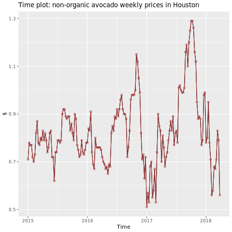
휴스턴 지역에 집중합니다.
library(fpp2)
conv_houston <- avocado2 %>%
  filter(region == "Houston",
         type == "conventional") %>%
  group_by(date) %>%
  summarise(average_price = mean(average_price))

# Set up ts

conv_houston_ts <- ts(conv_houston$average_price,
                 start = c(2015, 1),
                 frequency = 52)
# Plot

autoplot(conv_houston_ts) +
  labs(title = "Time plot: nonorganic avocado weekly prices in Houston",
       y = "$") +
  geom_point(colour = "brown", shape = 21) +
  geom_path(colour = "brown")
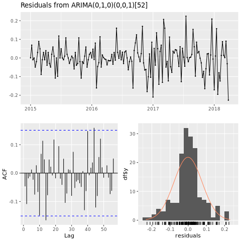
ARIMA(자동 회귀 통합 이동 평균)를 기반으로 휴스턴 지역에 대한 가격 예측 모델을 빌드합니다.
conv_houston_ts_arima <- auto.arima(conv_houston_ts,
                                    d = 1,
                                    approximation = F,
                                    stepwise = F,
                                    trace = T)
checkresiduals(conv_houston_ts_arima)
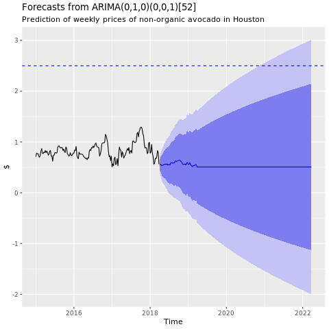
휴스턴 ARIMA 모델의 예측 그래프를 표시합니다.
conv_houston_ts_arima_fc <- forecast(conv_houston_ts_arima, h = 208)

autoplot(conv_houston_ts_arima_fc) + labs(subtitle = "Prediction of weekly prices of nonorganic avocados in Houston",
       y = "$") +
  geom_hline(yintercept = 2.5, linetype = 2, colour = "blue")
이벤트
3월 31일 오후 11시 - 4월 2일 오후 11시
궁극적인 Microsoft Fabric, Power BI, SQL 및 AI 커뮤니티 주도 이벤트입니다. 2025년 3월 31일부터 4월 2일까지.
지금 등록