Note
Access to this page requires authorization. You can try signing in or changing directories.
Access to this page requires authorization. You can try changing directories.
Power Apps is a high-productivity platform for business apps. You can create tailored, pixel-perfect apps with the power of a blank canvas in Power Apps Studio. To share with your users, render the app in the browser or embed it in various containers such as Teams and SharePoint sites.
The core end-user experiences for the SAP procurement template's solutions are built by using canvas apps and can easily be extended to support your local business requirements. To get started, follow the patterns and best practices in this article.
Follow best practices and standards
Develop all apps by using published best practices and standards. Adopt the same or similar best practices and standards as you extend or create new apps.
| Standard | Comments | More information |
|---|---|---|
| Feature Status | Features that are turned on or off by default. Includes a subset of preview features except experimental features. | Understand experimental, preview, and retired features in canvas apps |
| Responsiveness | Responsive to single device type such as tablet or mobile. Allows the app to snap to various standard screen and container sizes including embedding the apps within Microsoft Teams. Uses auto-layout responsive container controls extensively. | Building responsive canvas apps |
| Naming & Coding Standards | Controls, variables, collections, and Dataverse naming standards are followed to promote ease of discovery and maintenance. | Power Apps Canvas App Coding Standards and Guidelines |
| Accessibility | Properties that support accessibility. For example, Accessible Labels, Roles, Live, Focus Border Thickness, Color Contrast, and Tab Orders. These properties avoid known design patterns that don't support accessibility requirements. | Create accessible canvas apps and Accessibility limitations in canvas apps |
| Performance | Best practices are followed to avoid known performance limitations. | Tips and best practices to improve performance of canvas apps |
Global app color themes
All apps follow a custom theme that you can change to match your organization's preferred color scheme. Set a global variable in the App.OnStart property for all the apps. Most color-related properties across all controls in the app use this variable. When you change the color global theme variable, the app immediately reflects the change after running the App.OnStart event.
Important
Although you can change many color palette properties, change only the primary color property in the global theme variable.
    Set(
        varThemeColors,
        {
            background: ColorValue("#FAF9F8"),
            backgroundFill: ColorValue("#FFFFFF"),
            backgroundFillDisabled: ColorValue("#F3F2F1"),
            text: ColorValue("#201F1E"),
            altText: ColorValue("#FFFFFF"),
            disabledText: ColorValue("#A19F9D"),
            primary: ColorValue("#0078D4"),
            secondary: ColorValue("#EFF6FC"),
            tertiary: ColorValue("#005A9E"),
            primaryGray: ColorValue("#8A8886"),
            secondaryGray: ColorValue ("#C8C6C4"),
            tertiaryGray: ColorValue("#605E5C"),
            requiredRed: ColorValue("#A80000"),
            lookupBlue: ColorValue("#0078D4")
        }
    )
Add your corporate logo
Add your corporate logo to the apps by first uploading your corporate logo image file to the app and then adding it to the ScreenHeader component.
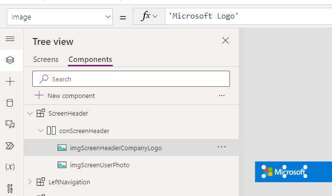
For more information, see Using multimedia files in canvas apps.
Localization and global app support
All canvas apps support the English language by default. However, all apps are designed to be localization ready and you can manage them to support more languages. You might need to change control-width properties directly depending on the languages you choose to deploy.
String localization pattern
- On the first screen's OnVisible property during the launch of the app, the app reads the user's browser language setting and determines the corresponding ISO Language Code choice value.
      Set(
        varISOUserLanguageCode,
        Switch(
            Left(
                Language(),
                2
            ),
            "ar",
            'ISO Language Code'.ar,
            "de",
            'ISO Language Code'.de,
            "en",
            'ISO Language Code'.en,
            "es",
            'ISO Language Code'.es,
            "fr",
            'ISO Language Code'.fr,
            "he",
            'ISO Language Code'.he,
            "it",
            'ISO Language Code'.it,
            "ja",
            'ISO Language Code'.ja,
            "pt",
            'ISO Language Code'.pt,
            "zh",
            'ISO Language Code'.zh,
            'ISO Language Code'.en
        )
    )
Note
Label and input control properties attempt to anticipate the width of the localized text value but might not always be successful given the complexities of that calculation. Always test and make minor edits to the apps once localized strings and changes are made.
Tip
Add more values to the ISO Language Code choice component contained in the SAP Base solution to support additional languages.
The app queries the SAP Localization Dataverse entity for strings that are localized per the user's logged-in language and caches them locally in a collection.
        ClearCollect(
            colUserLocalizedStrings,
            Filter(
                'SAP Localizations',
                Language = varISOUserLanguageCode,
                'SAP Localizations (Views)'.'Active SAP Localizations'
            )
        )
All text-related properties within various controls such as Text, HintText, Accessible Label, InputTextPlaceholder, NoSelectionText, and ToolTips have formulas that look first for an equivalent localized string. If they don't find the equivalent, they default to English, which is set in the Text property within the With block.
  With(
      {Text: "Vendor name"},
      If(
          IsBlank(
              LookUp(
                  colUserLocalizedStrings,
                  'English Value' = Text
              ).'Localized Value'
          ),
          Text,
          LookUp(
              colUserLocalizedStrings,
              'English Value' = Text
          ).'Localized Value'
      )
  )
For combo box controls that filter values from the SAP List of Value table, the user's mapped ISO Language Code from their browser's setting is always applied to the filter criteria, defaulting to English if no list of values is administered for their language.
Sort(
    Filter(
        'SAP List of Values',
        Status = 'Status (SAP List of Values)'.Active,
        Domain = 'Domain (SAP List of Values)'.Country,
        Language = varISOUserLanguageCode
    ),
    'Display Value'
)
Browser locale settings
All number, date, and time fields in the canvas apps honor the user's browser locale settings by default. For example, a date displayed as 3/23/2023 for a user using United States as their locale settings shows as 23.03.2023 for a user using the Germany locale setting.
More information: Build global support into canvas apps
Components
Components simplify the app development and maintenance process and help improve performance.
Use components to provide a common user experience either internally or across apps. Because of limitations on component libraries to support things like access to app scope and embedded cloud flows, use local components. You can use local components in all of your apps and import them to other apps.
For example, the VendorSearch component is used across all the apps that support procure-to-pay processes. You primarily build it within the SAP Vendor Management app and import it for use within the other procure-to-pay apps.
Warning
A negative consequence of using local app components versus component libraries is that if you make a change, you need to make that change across all the apps that already imported that component.
Common components used throughout the apps:
| Component | Description |
|---|---|
| ScreenHeader | Common header across every screen |
| LeftNavigation | Main navigation that allows quick access to other apps driven by Menu Item Dataverse source |
| CommandBar | List of common controls to create, change, save, cancel, search, recent search, or advance search objects |
| ScreenTabs | Groups of logical components arranged together into tabs for easy navigation |
| NoItemsDisplay | Items are shown in grids when no records are present |
| ObjectNameSearch | Common SAP object search components are included in the appropriate app where used and can be imported into other apps if needed. Examples include VendorSearch, GLAccountSearch, MaterialSearch, and RequisitionSearch |
More information: Canvas component overview
Additional SAP fields
Every SAP implementation is different, and you might need to add your own fields to support your business processes. The app provides ample screen space and design considerations so you can easily add the fields you need.
Common control containers
Most controls are contained within a container that consists of both a label and an input control. For example, the field to capture the name of the vendor within the SAP Vendor Management app consists of a Label and Text Input control, as seen in the following screenshot. To add a new field, copy an existing container control and paste it in the appropriate responsive component. Then, update the names, text, and mapped fields.

Note
Similar containers exist for other types of input controls, like ComboBoxes, Date Pickers, and Buttons.
Responsive containers
The apps are designed to be responsive to the tablet and desktop device types by using vertical and horizontal container controls, as shown in the following screenshot. These containers are configured to have starting points for properties such as height, width, LayoutMinHeight, LayoutMinWidth, and Wrap. As you add more fields to these containers, ensure you update these properties to keep the responsiveness working appropriately.
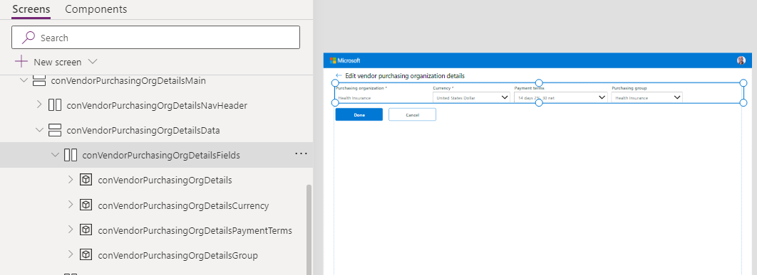
More information: Autolayout containers
Connect with other data
The power of canvas apps is that they can easily connect into one of several hundred other systems and applications securely by using their native connector library.
For example, if your SAP Procurement purchase order process requires data from upstream presales opportunities that exist in a CRM to complete the process, you can use the Salesforce or Dataverse connectors to integrate with Dynamics 365 so you can easily add that data to the SAP Purchase Order app by simply selecting a button.
If you have an internal proprietary system or a system with no native connector, you can work with your IT team to create a custom connector that allows Power Apps to easily interface with that system through a supported API.
More information:
App error handling
All embedded flow calls evaluate a response status field that the flows send back. They handle errors by raising a message through the Notify function. For more information, see Error handling.
If(
    !IsBlank(FirstError.Message),
    Patch(
        'SAP Integration Errors',
        Defaults('SAP Integration Errors'),
        {
            Action: FirstError.Source,
            'Additional Information': App.ActiveScreen.Name,
            'Error Message': FirstError.Message,
            Name: "SAP Vendor Management",
            'Source Type': 'Source Type (SAP Integration Errors)'.'Power App',
            'Workflow Status': 'Workflow Status (SAP Integration Errors)'.Failed
        }
    );
Trace(FirstError.Message);
Error(FirstError);
)
The app handles all unexpected exceptions in the App.OnError property. The app creates a SAP solution template error record before it rethrows and traces the error. Admins can view the error details and put triggers in place to be alerted on app unhandled exceptions as seen in the Monitor errors document.
More information: OnError property
Related content
- What are canvas apps?
- Understand Power Apps Studio
- Create a canvas app from within a solution
- Building reusable UI with Power Apps component framework and canvas apps components
- Administer Microsoft Power Platform
- Canvas apps for enterprise developers, partners, and ISVs
Next steps
Extend model-driven apps and Dataverse