Tutoriel : utiliser R pour prédire le prix des avocats
Article 26/11/2024
8 contributeurs
Commentaires
Dans cet article
Prérequis
Charger les bibliothèques
Chargement des données
Manipuler les données
Installer de nouveaux packages
Analyser et visualiser les données
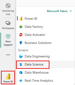
Entraîner un modèle Machine Learning
Contenu connexe
Afficher 4 de plus
Ce tutoriel présente un exemple de bout en bout d'un flux de travail science des données Synapse dans Microsoft Fabric. Il utilise R pour analyser et visualiser les prix des avocats aux États-Unis, afin de construire un modèle Machine Learning qui prédit les prix futurs des avocats.
Ce didacticiel couvre ces étapes :
Charger des bibliothèques par défaut
Chargement des données
Personnaliser les données
Ajouter de nouveaux packages à la session
Analyser et visualiser les données
Entraîner le modèle
Ouvrez ou créez un notebook. Pour en savoir plus, consultez Comment utiliser les blocs-notes Microsoft Fabric .
Réglez l’option de langue sur SparkR (R) pour modifier la langue principale.
Attachez votre notebook à lakehouse. Sur le côté gauche, sélectionnez Ajouter pour ajouter un lakehouse existant ou pour créer un lakehouse.
Charger les bibliothèques Utilisez les bibliothèques du runtime R par défaut :
library(tidyverse)
library(lubridate)
library(hms)
Lisez les prix des avocats à partir d'un fichier .CSV, téléchargé sur Internet :
df <- read.csv('https://synapseaisolutionsa.blob.core.windows.net/public/AvocadoPrice/avocado.csv', header = TRUE)
head(df,5)
Tout d'abord, donnez aux colonnes des noms plus sympathiques.
# To use lowercase
names(df) <- tolower(names(df))

# To use snake case
avocado <- df %>%
  rename("av_index" = "x",
         "average_price" = "averageprice",
         "total_volume" = "total.volume",
         "total_bags" = "total.bags",
         "amount_from_small_bags" = "small.bags",
         "amount_from_large_bags" = "large.bags",
         "amount_from_xlarge_bags" = "xlarge.bags")

# Rename codes
avocado2 <- avocado %>%
  rename("PLU4046" = "x4046",
         "PLU4225" = "x4225",
         "PLU4770" = "x4770")

head(avocado2,5)
Modifiez les types de données, supprimez les colonnes indésirables et ajoutez la consommation totale :
# Convert data
avocado2$year = as.factor(avocado2$year)
avocado2$date = as.Date(avocado2$date)
avocado2$month  = factor(months(avocado2$date), levels = month.name)
avocado2$average_price =as.numeric(avocado2$average_price)
avocado2$PLU4046 = as.double(avocado2$PLU4046)
avocado2$PLU4225 = as.double(avocado2$PLU4225)
avocado2$PLU4770 = as.double(avocado2$PLU4770)
avocado2$amount_from_small_bags = as.numeric(avocado2$amount_from_small_bags)
avocado2$amount_from_large_bags = as.numeric(avocado2$amount_from_large_bags)
avocado2$amount_from_xlarge_bags = as.numeric(avocado2$amount_from_xlarge_bags)


# Remove unwanted columns
avocado2 <- avocado2 %>%
  select(-av_index,-total_volume, -total_bags)

# Calculate total consumption
avocado2 <- avocado2 %>%
  mutate(total_consumption = PLU4046 + PLU4225 + PLU4770 + amount_from_small_bags + amount_from_large_bags + amount_from_xlarge_bags)
Installer de nouveaux packages Utilisez l'installation de package en ligne pour ajouter de nouveaux packages à la session :
install.packages(c("repr","gridExtra","fpp2"))
Chargez les bibliothèques nécessaires.
library(tidyverse)
library(knitr)
library(repr)
library(gridExtra)
library(data.table)
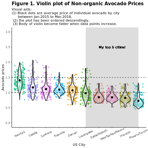
Analyser et visualiser les données Comparez les prix des avocats conventionnels (non biologiques) par région :
options(repr.plot.width = 10, repr.plot.height =10)
# filter(mydata, gear %in% c(4,5))
avocado2 %>%
  filter(region %in% c("PhoenixTucson","Houston","WestTexNewMexico","DallasFtWorth","LosAngeles","Denver","Roanoke","Seattle","Spokane","NewYork")) %>%
  filter(type == "conventional") %>%
  select(date, region, average_price) %>%
  ggplot(aes(x = reorder(region, -average_price, na.rm = T), y = average_price)) +
  geom_jitter(aes(colour = region, alpha = 0.5)) +
  geom_violin(outlier.shape = NA, alpha = 0.5, size = 1) +
  geom_hline(yintercept = 1.5, linetype = 2) +
  geom_hline(yintercept = 1, linetype = 2) +
  annotate("rect", xmin = "LosAngeles", xmax = "PhoenixTucson", ymin = -Inf, ymax = Inf, alpha = 0.2) +
  geom_text(x = "WestTexNewMexico", y = 2.5, label = "My top 5 cities!", hjust = 0.5) +
  stat_summary(fun = "mean") +
  labs(x = "US city",
       y = "Avocado prices",
       title = "Figure 1. Violin plot of nonorganic avocado prices",
       subtitle = "Visual aids: \n(1) Black dots are average prices of individual avocados by city \n     between January 2015 and March 2018. \n(2) The plot is ordered descendingly.\n(3) The body of the violin becomes fatter when data points increase.") +
  theme_classic() +
  theme(legend.position = "none",
        axis.text.x = element_text(angle = 25, vjust = 0.65),
        plot.title = element_text(face = "bold", size = 15)) +
  scale_y_continuous(lim = c(0, 3), breaks = seq(0, 3, 0.5))
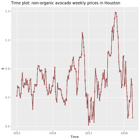
Concentrez-vous sur la région de Houston.
library(fpp2)
conv_houston <- avocado2 %>%
  filter(region == "Houston",
         type == "conventional") %>%
  group_by(date) %>%
  summarise(average_price = mean(average_price))

# Set up ts

conv_houston_ts <- ts(conv_houston$average_price,
                 start = c(2015, 1),
                 frequency = 52)
# Plot

autoplot(conv_houston_ts) +
  labs(title = "Time plot: nonorganic avocado weekly prices in Houston",
       y = "$") +
  geom_point(colour = "brown", shape = 21) +
  geom_path(colour = "brown")
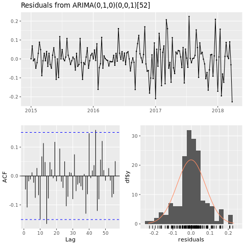
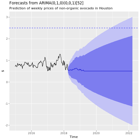
Entraîner un modèle Machine Learning Créez un modèle de prédiction de prix pour la région de Houston, basé sur la moyenne mobile intégrée autorégressive (ARIMA) :
conv_houston_ts_arima <- auto.arima(conv_houston_ts,
                                    d = 1,
                                    approximation = F,
                                    stepwise = F,
                                    trace = T)
checkresiduals(conv_houston_ts_arima)
Présentez un graphique des prédictions du modèle ARIMA de Houston :
conv_houston_ts_arima_fc <- forecast(conv_houston_ts_arima, h = 208)

autoplot(conv_houston_ts_arima_fc) + labs(subtitle = "Prediction of weekly prices of nonorganic avocados in Houston",
       y = "$") +
  geom_hline(yintercept = 2.5, linetype = 2, colour = "blue")