학습
모듈
.NET MAUI XAML 페이지에서 레이아웃 사용자 지정 - Training
StackLayout 및 Grid를 사용하여 여러 디바이스에서 일관적인 사용자 인터페이스를 만듭니다.
리본 명령 모음에서 호스트되는 컨트롤은 Windows 리본 프레임워크에 의해 적용되며 리본 태그에 선언된 대로 기본 동작과 레이아웃 템플릿(프레임워크 정의 및 사용자 지정 모두)의 조합에 따라 적용되는 레이아웃 규칙이 적용됩니다. 이러한 규칙은 명령 모음의 컨트롤이 런타임에 다양한 리본 크기에 적응하는 방식에 영향을 주는 Ribbon 프레임워크의 적응형 레이아웃 동작을 정의합니다.
리본 프레임워크에서 정의한 적응형 레이아웃은 리본 UI 내의 모든 컨트롤이 런타임에 리본의 크기 변경에 따라 조직, 크기, 형식 및 상대 배율을 동적으로 조정할 수 있는 기능입니다.
프레임워크는 다양한 레이아웃 동작을 지정하고 사용자 지정하는 데 전념하는 태그 요소 집합을 통해 적응형 레이아웃 기능을 노출합니다. SizeDefinitions라는 템플릿 컬렉션은 프레임워크에 의해 정의되며, 각 템플릿은 다양한 컨트롤 및 레이아웃 시나리오를 지원합니다. 그러나 프레임워크는 미리 정의된 템플릿이 애플리케이션에 필요한 UI 환경 또는 레이아웃을 제공하지 않는 경우 사용자 지정 템플릿도 지원합니다.
컨트롤을 특정 리본 크기의 기본 레이아웃으로 표시하려면 미리 정의된 템플릿과 사용자 지정 템플릿이 모두 ScalingPolicy 요소와 함께 작동합니다. 이 요소에는 리본을 렌더링할 때 프레임워크에서 가이드로 사용하는 크기 기본 설정 매니페스트가 포함되어 있습니다.
참고
리본 프레임워크는 조직에 대한 기본 제공 추론 집합을 기반으로 기본 레이아웃 동작을 제공하고 미리 정의된 SizeDefinition 템플릿 없이 런타임에 컨트롤을 표시합니다. 그러나 이 기능은 프로토타입 생성 용도로만 사용됩니다.
리본 프레임워크는 리본 컨트롤 그룹에 대한 크기 및 레이아웃 동작을 지정하는 포괄적인 SizeDefinition 템플릿 집합을 제공합니다. 이러한 템플릿은 리본 애플리케이션에서 컨트롤을 구성하는 가장 일반적인 시나리오를 다룹니다.
리본 애플리케이션에서 일관된 사용자 환경을 적용하기 위해 각 SizeDefinition 템플릿은 컨트롤 또는 지원하는 컨트롤 제품군에 제한을 적용합니다.
예를 들어 단추 컨트롤 패밀리에는 다음이 포함됩니다.
컨트롤의 입력 패밀리에는 다음이 포함됩니다.
확인란 및 리본 메뉴 내 갤러리 는 단추 패밀리 또는 입력 패밀리에 속하지 않습니다. 이러한 두 컨트롤은 SizeDefinition 템플릿에 명시적으로 표시된 경우에만 사용할 수 있습니다.
다음은 각 템플릿에서 허용하는 레이아웃 및 컨트롤에 대한 설명이 포함된 SizeDefinition 템플릿 목록입니다.
중요
태그에 선언된 컨트롤이 연결된 템플릿에 정의된 컨트롤 형식, 순서 및 수량에 정확히 매핑되지 않으면 태그 컴파일러에 의해 유효성 검사 오류가 기록되고 컴파일이 종료됩니다.
OneButton
하나의 단추 패밀리 컨트롤입니다.
큰 그룹 크기만 지원됩니다.

TwoButtons
두 개의 단추 패밀리 컨트롤입니다.
큰 그룹 및 중간 그룹 크기만 지원됩니다.
ThreeButtons
세 개의 단추 패밀리 컨트롤입니다.
큰 그룹 및 중간 그룹 크기만 지원됩니다.
ThreeButtons-OneBigAndTwoSmall
세 개의 단추 패밀리 컨트롤입니다.
첫 번째 단추는 세 가지 크기 모두에 눈에 띄게 표시됩니다.
ThreeButtonsAndOneCheckBox
단일 CheckBox 컨트롤과 함께 세 개의 단추 패밀리 컨트롤입니다.
큰 그룹 및 중간 그룹 크기만 지원됩니다.
FourButtons
4개의 단추 패밀리 컨트롤.
FiveButtons
5개의 단추 패밀리 컨트롤.
FiveOrSixButtons
5개의 단추 패밀리 컨트롤과 선택적 여섯 번째 단추.
SixButtons
6개의 단추 패밀리 컨트롤.
SixButtons-TwoColumns
6개의 단추 패밀리 컨트롤(대체 프레젠테이션).
세븐버튼
7개의 단추 패밀리 컨트롤.
EightButtons
8개의 단추 패밀리 컨트롤.
EightButtons-LastThreeSmall
8개의 단추 패밀리 컨트롤(대체 프레젠테이션).
참고
이 템플릿으로 선언된 모든 컨트롤 요소는 처음 5개 요소에 대해 하나씩, 마지막 세 개의 요소에 대해 하나씩 두 개의 ControlGroup 요소에 포함되어야 합니다.
다음 예제에서는 이 템플릿에 필요한 태그를 보여 줍니다.
<Group CommandName="cmdSizeDefinitionsGroup"
       SizeDefinition="EightButtons-LastThreeSmall">
  <ControlGroup>
    <Button CommandName="cmdSDButton1" />
    <Button CommandName="cmdSDButton2" />
    <Button CommandName="cmdSDButton3" />
    <Button CommandName="cmdSDButton4" />
    <Button CommandName="cmdSDButton5" />
  </ControlGroup>
  <ControlGroup>
    <Button CommandName="cmdSDButton6" />
    <Button CommandName="cmdSDButton7" />
    <Button CommandName="cmdSDButton8" />
  </ControlGroup>
</Group>
NineButtons
9개의 단추 패밀리 컨트롤.
TenButtons
10개의 단추 패밀리 컨트롤.
ElevenButtons
11개의 버튼 패밀리 컨트롤.
OneFontControl
하나의 FontControl입니다.
큰 그룹 및 중간 그룹 크기만 지원됩니다.
중요
사용자 지정 템플릿 정의 내에 FontControl을 포함하는 것은 프레임워크에서 지원되지 않습니다.
OneInRibbonGallery
크고 작은 그룹 크기만 지원됩니다.
InRibbonGalleryAndBigButton
하나의 InRibbonGallery 컨트롤 및 단추 패밀리 컨트롤.
크고 작은 그룹 크기만 지원됩니다.
InRibbonGalleryAndButtons-GalleryScalesFirst
리본 갤러리 컨트롤 1개와 단추 패밀리 컨트롤 2개 또는 3개
갤러리는 중간 및 소규모 그룹 크기의 팝업 표현으로 축소됩니다.
ButtonGroups
단추 패밀리 컨트롤 32개(대부분 선택 사항)의 복잡한 배열입니다.
참고
큰 ButtonGroups 템플릿의 선택적 전체 크기 단추를 제외하고 이 템플릿으로 선언된 모든 컨트롤 요소는 ControlGroup 요소에 포함되어야 합니다.
다음 예제에서는 이 템플릿을 사용하여 32개의 컨트롤 요소(필수 및 선택 사항)를 모두 표시하는 데 필요한 태그를 보여 줍니다.
<Group CommandName="cmdSizeDefinitionsGroup"
       SizeDefinition="ButtonGroups">
  <!-- Row 1 -->
  <ControlGroup>
    <ControlGroup>
      <Button CommandName="cmdSDButton1" />
      <Button CommandName="cmdSDButton2" />
      <Button CommandName="cmdSDButton3" />
      <Button CommandName="cmdSDButton4" />
      <Button CommandName="cmdSDButton5" />
      <Button CommandName="cmdSDButton6" />
      <Button CommandName="cmdSDButton7" />
      <Button CommandName="cmdSDButton8" />
      <Button CommandName="cmdSDButton9" />
      <Button CommandName="cmdSDButton10" />
    </ControlGroup>
    <ControlGroup>
      <Button CommandName="cmdSDButton11" />
      <Button CommandName="cmdSDButton12" />
    </ControlGroup>
    <ControlGroup>
      <Button CommandName="cmdSDButton13" />
      <Button CommandName="cmdSDButton14" />
    </ControlGroup>
    <ControlGroup>
      <Button CommandName="cmdSDButton15" />
    </ControlGroup>
    <ControlGroup>
      <Button CommandName="cmdSDButton16" />
    </ControlGroup>
    <ControlGroup>
      <Button CommandName="cmdSDButton17" />
      <Button CommandName="cmdSDButton18" />
    </ControlGroup>
  </ControlGroup>
  <!-- Row 2 -->
  <ControlGroup>
    <ControlGroup>
      <Button CommandName="cmdSDButton19" />
      <Button CommandName="cmdSDButton20" />
      <Button CommandName="cmdSDButton21" />
      <Button CommandName="cmdSDButton22" />
      <Button CommandName="cmdSDButton23" />
      <Button CommandName="cmdSDButton24" />
      <Button CommandName="cmdSDButton25" />
      <Button CommandName="cmdSDButton26" />
      <Button CommandName="cmdSDButton27" />
      <Button CommandName="cmdSDButton28" />
    </ControlGroup>
    <ControlGroup>
      <Button CommandName="cmdSDButton29" />
    </ControlGroup>
    <ControlGroup>
      <Button CommandName="cmdSDButton30" />
      <Button CommandName="cmdSDButton31" />
    </ControlGroup>
  </ControlGroup>
  <Button CommandName="cmdSDButton32" />
</Group>
ButtonGroupsAndInputs
두 개의 입력 패밀리 컨트롤(두 번째는 선택 사항)과 29개의 단추 패밀리 컨트롤의 복잡한 정렬이 뒤따릅니다(대부분은 선택 사항).
큰 그룹 및 중간 그룹 크기만 지원됩니다.
참고
이 템플릿으로 선언된 모든 컨트롤 요소는 ControlGroup 요소에 포함되어야 합니다.
다음 예제에서는 이 템플릿을 사용하여 모든 컨트롤 요소(필수 및 선택 사항)를 표시하는 데 필요한 태그를 보여 줍니다.
<Group CommandName="cmdSizeDefinitionsGroup"
       SizeDefinition="ButtonGroupsAndInputs">
  <!-- Row 1 -->
  <ControlGroup>
    <ControlGroup>
      <ComboBox CommandName="cmdSDComboBox" />
      <Spinner CommandName="cmdSDSpinner" />
    </ControlGroup>
    <ControlGroup>
      <Button CommandName="cmdSDButton1" />
      <Button CommandName="cmdSDButton2" />
      <Button CommandName="cmdSDButton3" />
      <Button CommandName="cmdSDButton4" />
      <Button CommandName="cmdSDButton5" />
      <Button CommandName="cmdSDButton6" />
      <Button CommandName="cmdSDButton7" />
      <Button CommandName="cmdSDButton8" />
      <Button CommandName="cmdSDButton9" />
    </ControlGroup>
    <ControlGroup>
      <Button CommandName="cmdSDButton10" />
    </ControlGroup>
    <ControlGroup>
      <Button CommandName="cmdSDButton11" />
      <Button CommandName="cmdSDButton12" />
    </ControlGroup>
    <ControlGroup>
      <Button CommandName="cmdSDButton13" />
    </ControlGroup>
    <ControlGroup>
      <Button CommandName="cmdSDButton14" />
    </ControlGroup>
  </ControlGroup>
  <!-- Row 2 -->
  <ControlGroup>
    <ControlGroup>
      <Button CommandName="cmdSDButton15" />
      <Button CommandName="cmdSDButton16" />
      <Button CommandName="cmdSDButton17" />
      <Button CommandName="cmdSDButton18" />
      <Button CommandName="cmdSDButton19" />
      <Button CommandName="cmdSDButton20" />
      <Button CommandName="cmdSDButton21" />
      <Button CommandName="cmdSDButton22" />
      <Button CommandName="cmdSDButton23" />
      <Button CommandName="cmdSDButton24" />
    </ControlGroup>
    <ControlGroup>
      <Button CommandName="cmdSDButton25" />
      <Button CommandName="cmdSDButton26" />
    </ControlGroup>
    <ControlGroup>
      <Button CommandName="cmdSDButton27" />
      <Button CommandName="cmdSDButton28" />
    </ControlGroup>
    <ControlGroup>
      <Button CommandName="cmdSDButton29" />
    </ControlGroup>
  </ControlGroup>
</Group>
BigButtonsAndSmallButtonsOrInputs
두 개의 단추 패밀리 컨트롤(선택 사항 모두)과 두 개 또는 세 개의 단추 또는 입력 패밀리 컨트롤이 뒤따릅니다.
큰 그룹 및 중간 그룹 크기만 지원됩니다.

다음 코드 예제에서는 리본 태그에서 SizeDefinition 템플릿을 선언하는 방법에 대한 기본 데모를 제공합니다.
OneInRibbonGallery SizeDefinition은 이 특정 예제에 사용되지만 모든 프레임워크 템플릿은 비슷한 방식으로 지정됩니다.
<!-- InRibbonGallery -->
<Group CommandName="cmdInRibbonGalleryGroup" SizeDefinition="OneInRibbonGallery">
  <InRibbonGallery CommandName="cmdInRibbonGallery"
                   MaxColumns="10"
                   MaxColumnsMedium="5"
                   MinColumnsLarge="5"
                   MinColumnsMedium="3"
                   Type="Items">
    <InRibbonGallery.MenuLayout>
      <VerticalMenuLayout Rows="2"
                          Gripper="Vertical"/>
    </InRibbonGallery.MenuLayout>
    <InRibbonGallery.MenuGroups>
      <MenuGroup>
        <Button CommandName="cmdButton1"></Button>
        <Button CommandName="cmdButton2"></Button>
      </MenuGroup>
      <MenuGroup>
        <Button CommandName="cmdButton3"></Button>
      </MenuGroup>
    </InRibbonGallery.MenuGroups>
  </InRibbonGallery>
</Group>
SizeDefinition 템플릿의 축소 동작은 리본 태그에서 크기 조정 정책을 사용하여 제어할 수 있습니다.
ScalingPolicy 요소에는 리본의 크기를 조정할 때 하나 이상의 그룹 요소에 대한 적응형 레이아웃 기본 설정을 지정하는 ScalingPolicy.IdealSizes 및 Scale 선언의 매니페스트가 포함되어 있습니다.
참고
크기 조정 정책 세부 정보를 지정하여 그룹 요소가 전부는 아니지만 대부분 Size 특성이 같은 Scale 요소와 연결되도록 하는 것이 Popup좋습니다. 이렇게 하면 프레임워크가 스크롤 메커니즘을 자동으로 도입하기 전에 가능한 가장 작은 크기로 리본을 렌더링하고 가장 광범위한 디스플레이 디바이스를 지원할 수 있습니다.
다음 코드 예제에서는 홈 탭에서 컨트롤의 4개 그룹 각각에 대해 ScalingPolicy.IdealSizes SizeDefinition 기본 설정을 지정하는 ScalingPolicy 매니페스트를 보여 줍니다. 또한 Scale 요소는 각 그룹의 내림차순으로 축소 동작에 영향을 주도록 지정됩니다.
<Tab CommandName="Home">
  <Tab.ScalingPolicy>
    <ScalingPolicy>
      <ScalingPolicy.IdealSizes>
        <Scale Group="GroupClipboard" Size="Medium"/>
        <Scale Group="GroupView" Size="Large"/>
        <Scale Group="GroupFont" Size="Large"/>
        <Scale Group="GroupParagraph" Size="Large"/>
      </ScalingPolicy.IdealSizes>
      <Scale Group="GroupClipboard" Size="Small"/>
      <Scale Group="GroupClipboard" Size="Popup"/>
      <Scale Group="GroupFont" Size="Medium"/>
      <Scale Group="GroupFont" Size="Popup"/>
      <Scale Group="GroupParagraph" Size="Medium"/>
      <Scale Group="GroupParagraph" Size="Popup"/>
      <!--
        GroupView group is associated with the OneButton SizeDefinition.
        Since this template is constrained to one size (Large) there
        is no need to declare further scaling preferences.
      -->
    </ScalingPolicy>
  </Tab.ScalingPolicy>

  <Group CommandName="GroupClipboard" SizeDefinition="FourButtons">
    <Button CommandName="Paste"/>
    <Button CommandName="Cut"/>
    <Button CommandName="Copy"/>
    <Button CommandName="SelectAll"/>
  </Group>

  <Group CommandName="GroupFont"  ApplicationModes="1">
    <FontControl CommandName="Font" FontType="FontWithColor" />
  </Group>

  <Group CommandName="GroupParagraph"  ApplicationModes="1" SizeDefinition="ButtonGroups">
    <ControlGroup>
      <ControlGroup>
        <ToggleButton CommandName="Numbered" />
        <ToggleButton CommandName="Bulleted" />
      </ControlGroup>
    </ControlGroup>
    <ControlGroup>
      <ControlGroup>
        <ToggleButton CommandName="LeftJustify" />
        <ToggleButton CommandName="CenterJustify" />
        <ToggleButton CommandName="RightJustify" />
      </ControlGroup>
      <ControlGroup/>
      <ControlGroup>
        <Button CommandName="Outdent" />
        <Button CommandName="Indent" />
      </ControlGroup>
    </ControlGroup>
  </Group>

  <Group CommandName="GroupView" SizeDefinition="OneButton" >
    <ToggleButton CommandName="ViewSource"/>
  </Group>

</Tab>
기본 레이아웃 동작 및 미리 정의된 SizeDefinition 템플릿이 특정 레이아웃 시나리오에 대한 유연성이나 지원을 제공하지 않는 경우 사용자 지정 템플릿은 Ribbon.SizeDefinitions 요소를 통해 Ribbon 프레임워크에서 지원됩니다.
사용자 지정 템플릿은 두 가지 방법으로 선언할 수 있습니다. 즉, 다시 사용할 수 있는 명명된 템플릿을 선언하기 위해 Ribbon.SizeDefinitions 요소를 사용하는 독립 실행형 메서드 또는 그룹별 인라인 메서드입니다.
다음 코드 예제에서는 다시 사용할 수 있는 기본 사용자 지정 템플릿을 보여 줍니다.
<Ribbon.SizeDefinitions>
  <SizeDefinition Name="CustomTemplate">
    <GroupSizeDefinition Size="Large">
      <ControlSizeDefinition ImageSize="Large" IsLabelVisible="true" />
    </GroupSizeDefinition>
    <GroupSizeDefinition Size="Medium">
      <ControlSizeDefinition ImageSize="Small" IsLabelVisible="false" />
    </GroupSizeDefinition>
    <GroupSizeDefinition Size="Small">
      <ControlSizeDefinition ImageSize="Small" IsLabelVisible="false" />
    </GroupSizeDefinition>
  </SizeDefinition>
</Ribbon.SizeDefinitions>
다음 코드 예제에서는 네 개의 단추 그룹에 대한 기본 인라인 사용자 지정 템플릿을 보여 줍니다.
이 코드 섹션에서는 단추 그룹에 대한 명령 선언을 보여 줍니다. 크고 작은 이미지 리소스도 여기에 지정됩니다.
<!-- Button -->
<Command Name="cmdButtonGroup"
         Symbol="cmdButtonGroup"
         Comment="Button Group"
         LabelTitle="ButtonGroup"/>
<Command Name="cmdButton1"
         Symbol="cmdButton1"
         Comment="Button1"
         LabelTitle="Button1"/>
<Command Name="cmdButton2"
         Symbol="cmdButton2"
         Comment="Button2"
         LabelTitle="Button2"/>
<Command Name="cmdButton3"
         Symbol="cmdButton3"
         Comment="Button3"
         LabelTitle="Button3"/>
<Command Name="cmdButtonGroup2"
         Symbol="cmdButtonGroup2"
         Comment="Button Group2"
         LabelTitle="ButtonGroup2"/>
<Command Name="cmdButtonG21"
         Symbol="cmdButtonG21"
         Comment="ButtonG21"
         LabelTitle="ButtonG21">
  <Command.LargeImages>
    <Image Source="res/large.bmp"/>
  </Command.LargeImages>
  <Command.SmallImages>
    <Image Source="res/small.bmp"/>
  </Command.SmallImages>
</Command>
<Command Name="cmdButtonG22"
         Symbol="cmdButtonG22"
         Comment="ButtonG22"
         LabelTitle="ButtonG22">
  <Command.LargeImages>
    <Image Source="res/large.bmp"/>
  </Command.LargeImages>
  <Command.SmallImages>
    <Image Source="res/small.bmp"/>
  </Command.SmallImages>
</Command>
<Command Name="cmdButtonG23"
         Symbol="cmdButtonG23"
         Comment="ButtonG23"
         LabelTitle="ButtonG23">
  <Command.LargeImages>
    <Image Source="res/large.bmp"/>
  </Command.LargeImages>
  <Command.SmallImages>
    <Image Source="res/small.bmp"/>
  </Command.SmallImages>
</Command>
<Command Name="cmdButtonG24"
         Symbol="cmdButtonG24"
         Comment="ButtonG24"
         LabelTitle="ButtonG24">
  <Command.LargeImages>
    <Image Source="res/large.bmp"/>
  </Command.LargeImages>
  <Command.SmallImages>
    <Image Source="res/small.bmp"/>
  </Command.SmallImages>
</Command>
이 코드 섹션에서는 크고 중간 크기이며 작은 GroupSizeDefinition 템플릿을 정의하여 4개의 단추를 다양한 크기와 레이아웃으로 표시하는 방법을 보여 줍니다. 탭에 대한 ScalingPolicy 선언은 활성 탭에 필요한 리본 크기 및 공간을 기반으로 컨트롤 그룹에 사용되는 템플릿을 정의합니다.
        <Tab CommandName="cmdTab6">
          <Tab.ScalingPolicy>
            <ScalingPolicy>
              <ScalingPolicy.IdealSizes>
                <Scale Group="cmdButtonGroup"
                       Size="Large"/>
                <Scale Group="cmdButtonGroup2"
                       Size="Large"/>
                <Scale Group="cmdToggleButtonGroup"
                       Size="Large"/>
              </ScalingPolicy.IdealSizes>
              <Scale Group="cmdButtonGroup"
                     Size="Medium"/>
              <Scale Group="cmdButtonGroup2"
                     Size="Medium"/>
              <Scale Group="cmdButtonGroup2"
                     Size="Small"/>
              <Scale Group="cmdButtonGroup2"
                     Size="Popup"/>
            </ScalingPolicy>
          </Tab.ScalingPolicy>

          <Group CommandName="cmdButtonGroup2">
            <SizeDefinition>
              <ControlNameMap>
                <ControlNameDefinition Name="button1"/>
                <ControlNameDefinition Name="button2"/>
                <ControlNameDefinition Name="button3"/>
                <ControlNameDefinition Name="button4"/>
              </ControlNameMap>
              <GroupSizeDefinition Size="Large">
                <ControlGroup>
                  <ControlSizeDefinition ControlName="button1"
                                         ImageSize="Large"
                                         IsLabelVisible="true" />
                  <ControlSizeDefinition ControlName="button2"
                                         ImageSize="Large"
                                         IsLabelVisible="true" />
                </ControlGroup>
                <ColumnBreak ShowSeparator="true"/>
                <ControlGroup>
                  <ControlSizeDefinition ControlName="button3"
                                         ImageSize="Large"
                                        IsLabelVisible="true" />
                  <ControlSizeDefinition ControlName="button4"
                                        ImageSize="Large"
                                        IsLabelVisible="true" />
                </ControlGroup>
              </GroupSizeDefinition>
              <GroupSizeDefinition Size="Medium">
                <Row>
                  <ControlSizeDefinition ControlName="button1"
                                         ImageSize="Small"
                                         IsLabelVisible="true" />
                  <ControlSizeDefinition ControlName="button3"
                                         ImageSize="Small"
                                         IsLabelVisible="true" />
                </Row>
                <Row>
                  <ControlSizeDefinition ControlName="button2"
                                         ImageSize="Small"
                                         IsLabelVisible="true" />
                  <ControlSizeDefinition ControlName="button4"
                                         ImageSize="Small"
                                         IsLabelVisible="true" />
                </Row>
              </GroupSizeDefinition>
              <GroupSizeDefinition Size="Small">
                <Row>
                  <ControlSizeDefinition ControlName="button1"
                                         ImageSize="Small"
                                         IsLabelVisible="true" />
                  <ControlSizeDefinition ControlName="button3"
                                         ImageSize="Small"
                                         IsLabelVisible="false" />
                </Row>
                <Row>
                  <ControlSizeDefinition ControlName="button2"
                                         ImageSize="Small"
                                         IsLabelVisible="true" />
                  <ControlSizeDefinition ControlName="button4"
                                         ImageSize="Small"
                                         IsLabelVisible="false" />
                </Row>
              </GroupSizeDefinition>
            </SizeDefinition>
            <Button CommandName="cmdButtonG21"></Button>
            <Button CommandName="cmdButtonG22"></Button>
            <Button CommandName="cmdButtonG23"></Button>
            <Button CommandName="cmdButtonG24"></Button>
          </Group>
          <Group CommandName="cmdCheckBoxGroup">
            <CheckBox CommandName="cmdCheckBox"></CheckBox>
          </Group>
          <Group CommandName="cmdToggleButtonGroup"
                 SizeDefinition="OneButton">
            <ToggleButton CommandName="cmdToggleButton"></ToggleButton>
          </Group>
          <Group CommandName="cmdButtonGroup"
                 SizeDefinition="ThreeButtons">
            <Button CommandName="cmdButton1"></Button>
            <Button CommandName="cmdButton2"></Button>
            <Button CommandName="cmdButton3"></Button>
          </Group>
        </Tab>
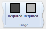
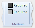
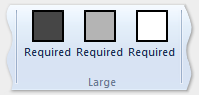
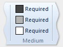
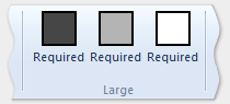
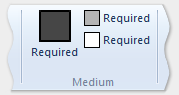
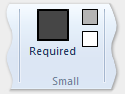
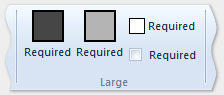
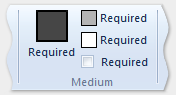
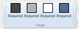
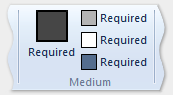
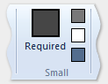
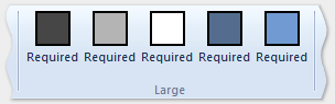
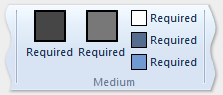
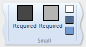
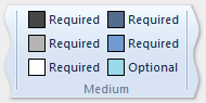
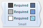
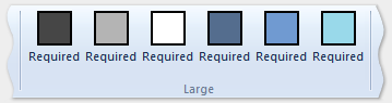
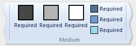
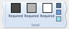
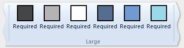
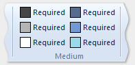
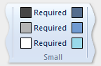
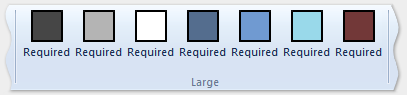
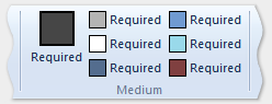
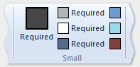
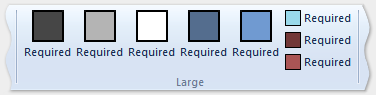
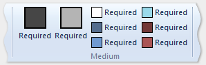
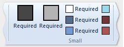
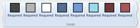
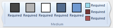
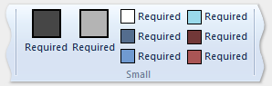
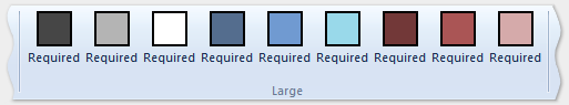
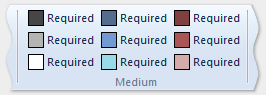
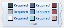
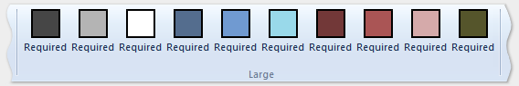
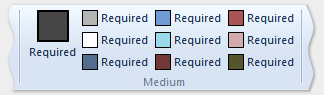
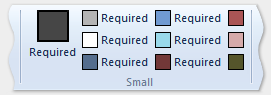
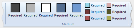
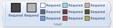
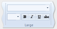
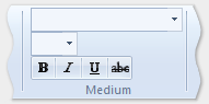
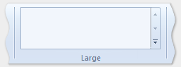
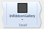
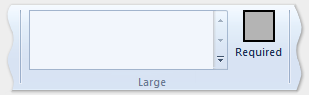
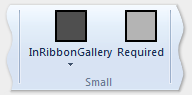
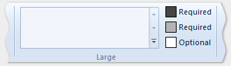
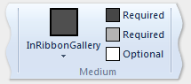
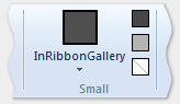
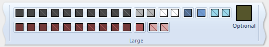
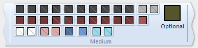
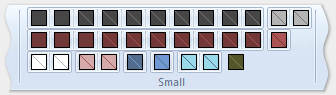
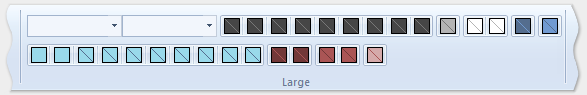
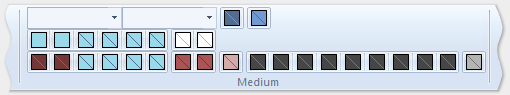
다음 이미지는 리본 크기 감소를 수용하기 위해 이전 예제의 템플릿을 리본 UI에 적용하는 방법을 보여 줍니다.
| Type | 이미지 |
|---|---|
| 대형 | 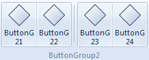 |
| 중간 | 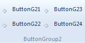 |
| 적은 | 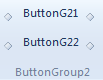 |
| 팝업 | 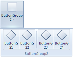 |
학습
모듈
.NET MAUI XAML 페이지에서 레이아웃 사용자 지정 - Training
StackLayout 및 Grid를 사용하여 여러 디바이스에서 일관적인 사용자 인터페이스를 만듭니다.