Note
Access to this page requires authorization. You can try signing in or changing directories.
Access to this page requires authorization. You can try changing directories.
This guest post is by the faculty of our Data Science MOOC, Dr. Stephen Elston, Managing Director at Quantia Analytics & Professor Cynthia Rudin from M.I.T.
Machine learning forms the core of data science and predictive analytics. Creating good ML models is a complex but satisfying undertaking. Aspiring data scientists can improve their ML knowledge and skills with this edX course. In the course, we help you build ML skills by investigating several comprehensive examples. It’s still not too late to sign up.
The faculty are available for a live office hour on Oct 19th to answer all your questions – register here.
Creating good ML models is a multi-faceted process, one that involves several steps, including:
Understanding the problem space. To have impact, ML models must deliver useful and actionable results. As a data scientist, you must develop an understanding of which results will be useful to your customers.
Prepare the data for analysis. We discussed this process in a previous blog post.
Explore and understand the structure of the data. This too was discussed in a previous blog post.
Find a set of features. Good feature engineering is essential to creating accurate ML models that generalize well. Feature engineering requires both an understanding of the structure of the data and the domain. Improving feature engineering often produces greater improvements in model performance than changes in parameters or even the exact choice of model.
Select a model. The nature of the problem and the structure of the data are the primary considerations in model selection.
Evaluate the performance of the model. Careful and systematic evaluation of model performance suggests ideas for improvement.
Cross validate the model. Once you have a promising model you should perform cross validation on the model. Cross validation helps to ensure that your model will generalize.
Publish the model and present results in an actionable manner. To add value, ML model results must be presented in a manner that users can understand and use.
These steps are preformed iteratively. The results of each step suggest improvements in previous steps. There is no linear path through this process.
Let’s look at a simplified example. The figure below shows the workflow of a ML model applied to a building energy efficiency data set. This workflow is created using the drag and drop tools available in the Microsoft Azure ML Studio.
You can find this dataset as a sample in Azure ML Studio, or it can be downloaded from the UCI Machine Learning Repository. These data are discussed in the paper by A. Tsanas, A. Xifara: 'Accurate quantitative estimation of energy performance of residential buildings using statistical machine learning tools', Energy and Buildings, Vol. 49, pp. 560-567, 2012.
These data contain eight physical characteristics of 768 simulated buildings. These features are used to predict the buildings’ heating load and cooling load, measures of energy efficiency. We will construct an ML model to predict a building’s heating load. The ability to predict a building’s energy efficiency is valuable in a number of circumstances. For example, architects may need to compare the energy efficiency of several building designs before selecting a final approach.

The first five modules in this workflow prepare the data for visualization and analysis. We discussed the preparation and visualization of these data in previous posts (see links above). Following the normalization of the numeric features, we use a Project Columns module to select the label and feature columns for computing the ML model.
The data are split into training and testing subsets. The testing subset is used to test or score the model, to measure the model’s performance. Note that, ideally, we should split this data three ways, to produce a training, testing and validation data set. The validation set is held back until we are ready to perform a final cross validation.
A decision forest regression model is defined, trained and scored. The scored labels are used to evaluate the model. A number of performance metrics are computed using the Evaluate Model module. The results produced by this module are shown in the figure below.
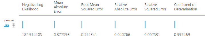
These results look promising. In particular, the Relative Absolute Error and the Relative Squared Error are fairly small. These values indicate the model residuals (errors) are relatively small compared to the values of the original label.
Having good performance metrics is certainly promising, but these aggregate metrics can hide many modeling problems. Graphical methods are ideal to explore model performance in depth. The figure below shows one such plot.

This plot shows the model residuals vs. the building heating load. Ideally, these residuals or errors should be independent of the variable being predicted. The plotted values have been conditioned by the overall height feature. Such conditioned plots help us identify subtle structure in the model residuals.
There is little systematic structure in the residuals. The distribution of the residuals is generally similar across the range of heating load values. This lack of structure is because of consistent model performance.
However, our eyes are drawn to a number of outliers in these residuals. Outliers are prominent in the upper and lower left quadrants of this plot, above about 1.0 and below about -0.8 for heating loads below 20. Notice that some of the outliers are for each of the two possible values of the overall height feature.
One possibility is that some of these outliers represent mis-coded data. Could the values of overall height have been reversed? Could there simply be erroneous values of heating load or of one of the other features? Only a careful evaluation, often using other plots, can tell. Once the data are corrected, a new model can be computed and evaluated. This iterative process shows how good ML models are created.
This plot was created using the ggplot2 package with the following R code running in an Azure ML Execute R Script module:
frame1 <- maml.mapInputPort(1)
## Compute the model residuals
frame1$Resids <- frame1$HeatingLoad - frame1$ScoredLable
## Plot of residuals vs HeatingLoad.
library(ggplot2)
ggplot(frame1, aes(x = HeatingLoad, y = Resids ,
by = OverallHeight)) +
geom_point(aes(color = OverallHeight)) +
xlab("Heating Load") + ylab("Residuals") +
ggtitle("Residuals vs Heating Load") +
theme(text = element_text(size=20))
Alternatively, we could have generated a similar plot using Python tools in an Execute Python Script Module in Azure ML:
def azureml_main(frame1):
import matplotlib
matplotlib.use('agg') # Set graphics backend
import matplotlib.pyplot as plt
## Compute the residuals
frame1['Resids'] = frame1['Heating Load'] - frame1['Scored Labels']
## Create data frames by Overall Height
temp1 = frame1.ix[frame1['Overall Height'] < 0.5]
temp2 = frame1.ix[frame1['Overall Height'] > 0.5]
## Create a scatter plot of residuals vs Heating Load.
fig = plt.figure(figsize=(9, 9))
ax = fig.gca()
temp1.plot(kind = 'scatter', x = 'Heating Load', y = 'Resids',
c = 'DarkBlue', alpha = 0.3, ax = ax)
temp2.plot(kind = 'scatter', x = 'Heating Load', y = 'Resids',
c = 'Red', alpha = 0.3, ax = ax)
plt.show()
fig.savefig('Resids.png')
Developing the knowledge and skills to apply ML is essential to becoming a data scientist. Learning how to apply and evaluate the performance of ML models is a multi-faceted subject – we hope you enjoy the process.
Stephen & Cynthia