Operations Manager Management Pack Authoring - Custom Dashboards
This document is part of the Operations Manager Management Pack Authoring Guide. The Microsoft System Center team has validated this procedure as of the Original Version. We will continue to review any changes and periodically provide validations on later revisions as they are made. Please feel free to make any corrections or additions to this procedure that you think would assist other users.
If you have requirements that cannot be met with dashboards created in the Operations Console, then you must create a custom dashboard. This is significantly more difficult than working in the Operations Console and requires understanding of the underlying concepts of how dashboards are configured in the management pack.
With custom dashboards you have the following options that are not available using widgets in the Operations Console.
- The Visualization Library has components that access and visualize data not possible with widgets.
- You can customize the layout of components on the dashboard in ways that are not possible with the Operations Console.
- You can control naming of the dashboard components and include their development with the rest of the management pack.
Custom dashboards are created using Visual Studio Authoring Extensions which provides services for working with management packs and management pack elements. There are no templates for dashboards, so you must work directly with the XML. Intellisense is available for dashboard elements which assists with configuring this XML.
Dashboards are only supported by System Center 2012 Operations Manager and later. While a management pack created for Operations Manager 2007 will work in System Center 2012, that management pack cannot contain a dashboard. If your management pack supports Operations Manager 2007, then you must create a separate management pack file for the dashboards. This file would reference the other files in the management pack. For further information on management pack files, see Management Pack Formats.
This guide provides conceptual guidance on the components that makeup dashboards in addition to the detailed XML that is required to create them.
Dashboards are made up of one or more Components which represent some element that will be included in the dashboard. This could be a visual element such as a list of alerts or graph illustrating performance data, or it could be a data element such as a query.
A set of components that provide a variety of required functionality are available in the Visualization Library management pack. The process of creating a dashboard primarily consists of creating components in your management pack that customize existing components in the Visualization Library. In order to create a custom dashboard, you need to understand what components are available and how to customize them to your requirements.
When we work with dashboards in the Operations Console, we refer to widgets, while we refer to components when working with custom dashboards. A widget is a component that can be added to a dashboard and configured in the Operations Console. You can use widgets when creating a custom dashboard, but you will treat them them like any other component. The one difference is that widgets have ComponentBehavior applied to the them which you can override to prevent the user from modifying the component
The following screenshot shows a sample custom dashboard identifying the different components that make it up. This is provided to illustrate the concept of how multiple components make up a single dashboard.
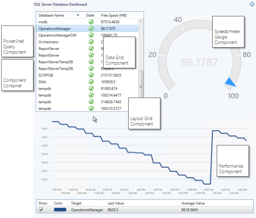
This dashboard uses a PowerShell script to list SQL Server databases with their health and free space. When a database is selected, it’s collected free space data is displayed in a graph, and it's free space percentage is displayed in a speedometer gauge.
Component |
Description |
| Layout Grid | Displays other components arranged in a grid. |
| PowerShell Query | Runs a PowerShell script and returns results that can be used by another component. |
| Data Grid | Displays data in a grid. Used in this case to display data from PowerShell script. |
Component Container |
Contains other components. Required in this case to group together data grid with query. |
Speedometer Gauge |
Graphically displays a numeric value. |
Performance |
Displays performance data on a line chart. |
Each Component is defined by a combination of the following management pack elements.
Element |
Description |
Component Type |
Declares the external interface for the component including any properties that it requires when used. Required by all components. |
Component Implementation |
Defines the detailed behavior of the component. Required for all components. |
Component Reference |
Adds a component to a folder in the Operations Console. Only required for top level components that will be visible to the user. |
Component Override |
Override one or more properties for a Component Type. Can be used in one management pack to modify the behavior of a component in another management pack or to customize a component without modifying the Component Implementation. |
Component Behavior |
Defines whether the user can customize the component in the Operations Console. Optional for all components. |
The Component Type defines the external interface for the component including any properties that it requires. When components reference another component, they specifically refer to the Component Type.
A Component Type may or may not specify a base component. If it does specify a based component, then it will inherit the properties and attributes from that component. In this case, the Component Implementation has the option of customizing the configuration of the base component. If the Component Type does not specify a base component, then the Component Type must define its own properties if any are required. In this case, the Component Implementation must specify the details for the functionality of the component.
The following table provides the attributes of a Component Type.
Attribute |
Description |
Accessibility |
Specifies whether the Component Type is available to elements in other management packs. |
Base |
Optional. Defines another Component Type that the current Component Type will inherit properties and attributes from. |
ID |
Unique identifier for the Component Type. |
Lifetime |
Determines whether the component can be removed from the dashboard. A value of ManagementPackElement means that the component will always be present in the dashboard. A value of ReferenceCount means that the component will be removed when no other component in the dashboard refers it. This is only used for dashboards that will allow configuration in the Operations Console. |
Target |
Optional. Specifies the base target data type for all implementations of the component. Each implementation can target this type or a type that inherits from it. |
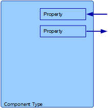
Some components will need information provided to them at runtime or may send information out at runtime. Component Properties are used to send data into and out of a component. These properties are declared with the Component Type and must specify whether they are incoming, outgoing, or both. A property can have a default value to be used if no value is provided from the calling component.
The following table provides the attributes of a Property.
Attribute |
Description |
Direction |
Binding direction of the property. Specifies whether the property passes data out, expects data to be passed in, or both. |
Name |
Name of the property. Must be unique for the Component Type. |
Type |
Data type of the property. |
The following sample XML shows a Component Type that does not use a base type and does not define any properties.
<ComponentType ID="MyMP.MyDashboard" Accessibility="Public" />
The following sample XML shows a Component Type that uses a base type but does not define any additional properties.
<ComponentType ID="MyMP.MyPerformanceWidget" Accessibility="Internal"Base="Visualization!Microsoft.SystemCenter.Visualization.PerformanceWidget" />
The following sample XML shows a Component Type that does not use a base type but defines an incoming and outgoing property. In this case, the Component Type requires an input parameter of type string to specify the database engines that the query will work against. It sends its output to the OutputCollection property which is available for other Component Types to access.
<ComponentType ID="MyMP.MyDatabaseQuery" Accessibility="Internal" >
  <Property Name="DBEngines" Type="xsd://string" BindingDirection="In" />
  <Property Name="OutputCollection" Type="mpinstance://Microsoft.SQLServer.Library!Microsoft.SQLServer.Database"BindingDirection="Out" />
</ComponentType>
The following sample XML shows a Component Type that has a property with a default value.
<ComponentType ID="MyMP.MyComponent" Accessibility="Internal" >
  <Property Name="ShowSearchBar" Type="xsd://boolean" BindingDirection="In">
    <SimpleValue Type="xsd://boolean" Value="True" />
  </Property>
</ComponentType>
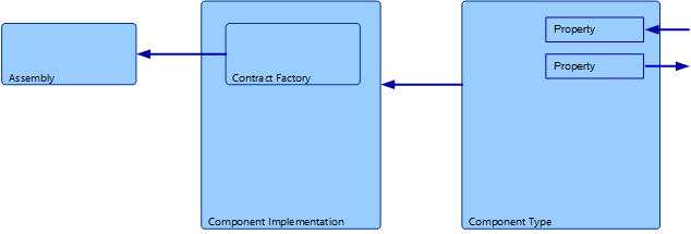
A Component Implementation defines the detailed operation of a component. You can think of the Component Type as providing a wrapper around the Component Implementation. Other components interact with the Component Type which relies on the Component Implementation for its functionality. To use a component, you only need to know the properties required for its Component Type. You don’t need to know any details about its Component Implementation.
There are two types of Component Implementation, Unit and Composite.
The functionality for Unit Component Implementations is contained within assemblies that are installed on the management server and delivered to the client as they are required. You can create a custom Unit Component using a programming language such as C#. This guide does not provide information on creatingUnit Component Implementations.
When you declare a Unit Component Implementation, you specify the assembly, called a ContractFactory, in the management pack.
Composite Components are made up from one other component and potentially one or more variables and one or more service overrides. A Composite Component Implementation allows you to customize the functionality of another component. You specify Bindings to provide values for the properties required by the component’s Component Type.
For example, the component Microsoft.SystemCenter.Visualization.PerformanceWidget displays performance data in a graph. A Composite Component Implementation would use that component and specify bindings that provided values for such properties as the performance counter, class, and display preferences.

While a Composite Components can only contain one other component, that component may contain multiple others. This is similar to the concept of aDiscovery that can contain only a single Data Source Module. The module that it contains though may be made up of other modules.
Certain components are able to reference other components through properties. The component is specified in a binding for the parent component. Bindings can then be provided to the contained component to set values for its properties. These values could refer to other components.
For example, the component Microsoft.SystemCenter.Visualization.LayoutGrid displays a grid that can contain other components. This component has a property called CellCollection that accepts the configuration for each cell. This includes the component that will be displayed in that cell.
Another example is Microsoft.SystemCenter.Visualization.ComponentContainer which is specifically designed to group together multiple components. It can be used as the top level component in Component Implementations that require multiple components.

The following table provides the attributes of a Component Implementation.
Attribute |
Description |
Accessibility |
Specifies whether the Component Implementation is available to elements in other management packs. |
ID |
Unique identifier for the Component Implementation. Unlike other management pack elements, this identifier only must be unique with the current management pack. |
Platform |
Specifies the platforms that the Component Implementation will work on. Valid values are WPF, Silverlight, or both. |
Target |
Specifies data or object that is passed to the component at runtime. |
TypeID |
ID attribute of the corresponding Component Type. |
Components can specify a base component with the Component Type. For a Component Type that uses a base component, the Component Implementation does not contain another component. Instead, it will define any parameters for the base component that should be modified.

Alternatively, the Component Implementation might not provide any bindings for the base component. Instead, the Component Type might be referenced by another component and the binding values provided at that time.