Note
Access to this page requires authorization. You can try signing in or changing directories.
Access to this page requires authorization. You can try changing directories.
Historically typefaces contained accented characters with diacritics that were separately designed for lowercase and uppercase characters. Generally the uppercase designs were shorter (to keep them in the em height) and more robust than the lowercase diacritics. In some type manufacturer's proprietary font formats there were algorithms to create composite accented characters. These typesetting systems used uppercase and lowercase diacritics that were on zero units with programmed logic for combining diacritics and base glyphs to make accent characters. In PostScript or TrueType formats, most fonts only contain lowercase spacing accents and these characters are used to create composite accented characters.
Advance width rules
Sometimes called en spacing accents, these diacritic widths are commonly on the en space. This is not a requirement. These characters can be placed on proportional widths but all glyphs should share that same value. These spacing accents are rarely used alone and are mostly used for creating composite accented characters. Their advance width is not used in the final composite character.
Vertical alignment rules
If there is only a single design for these characters, the design should be lowercase and positioned at the vertical height for use with lowercase characters.
There are two methods of aligning all diacritics. Both use the acute and grave as the models for all characters vertical positioning. The most common method of alignment is center alignment on the height of the acute and grave. The less frequent method is bottom aligning. All diacritics are aligned with the bottom of the acute or grave.
Spacing rules
Visually spaced between uppercase H and O.
Composite character placement rules
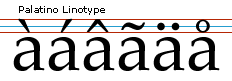
Vertical placement: Most commonly vertically placed so the space between the bottom of the acute and grave are offset approximately 5 to 10% of the em above the top of the lowercase overshoot height. In a 2048 em the space is usually between 100 and 200 units. Uppercase accents are usually closer to the tops of the base glyph than lowercase accents.
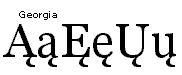
Example: Palatino Linotype regular has 98 units between the acute and uppercase O. There are 130 units between the acute and lowercase o. Georgia regular has 54 units between the acute and the uppercase O. There are 96 units between the acute and the lowercase o. Georgia accents are considered very tightly spaced. In both fonts the em is 2048.
Horizontal placement: Horizontally diacritics are to be placed in the visual center of the glyph. The two most difficult glyphs to center are the acute and grave. There are two common theories when centering these glyphs. A common way is to place the acute or grave so the front goes through an imaginary line of the visual center of the base glyph.
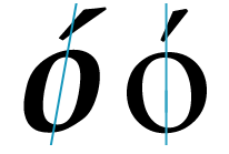
The second method was taught at the type foundries of Monotype and Mergenthaler Linotype. The acute is placed so 1/3 of its black width is on the left of the imaginary centerline of the base character and 2/3 are on the right of that line. The grave has 2/3rds on the left and 1/3 is on the right. This is considered a starting point and visual adjustment is made dependent on the design.
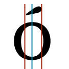
All other diacritics are placed so they visually center on an imaginary center line of each base glyph.
Note: In the Polish language the preferred angle of the acute is steeper than the acute diacritic's angle in most typefaces. For help on the design and position of the acute diacritic for the Polish language see Adam Twardoch's recommendations for the acute diacritic. A language dependent substitute would a good solution for the Polish language.
Specific character placement
Ogonek
The ogonek should be placed on the right stem of an uppercase A and to the left of center. In round featured glyphs such as the uppercase U and lowercase e care should be taken so the ogonek is placed just slightly to the right of center and the ogonek extends from the stroke as it would as a calligraphic stroke. For more help on designing the ogonek diacritic and its placement see Adam Twardoch's design recommendations for Polish accented characters.
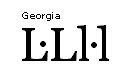
L or l Catalan (L with mid dot)
This character is actually a compound character made from a base character and an additional punctuation character. The mid dot is used in the Catalan language to separte two lowercase l or two uppercase L characters that are not part of the same syllable in a word.
The mid dot is commonly made from the overdot diacritic U+02D9 or a character made specifically for this purpose. Often the period U+002E, period centered U+2219 or mid dot U+00B7 are not an appropriate size for this character. The dot in the L or l Catalan character should be positioned to center vertically on the uppercase height and center horizontally when followed by another L or l.
Under comma and cedilla
The under comma is the preferred form in the Romanian language for the uppercase characters S and T with under comma accent and *lowercase s and t with under comma accent. Four new Unicode values have been defined to accommodate this preference.
Scommaaccent U+0218 ; scommaaccent U+0219 ; Tcommaaccent U+021A ; tcommaaccent U+021B
The connecting cedilla is the preferred form in the Turkish language for the uppercase S with cedilla and lowercase s with cedilla:
Scedilla U+015E ; scedilla U+015F
An under comma is an acceptable alternative to a connecting cedilla for the following characters:
- Ccedilla U+00c7 ; ccedilla U+00e7 ; Kcedilla U+0136 ; kcedilla U+0137
- Lcedilla U+013b ; lcedilla U+013c ; Ncedilla U+0145 ; ncedilla U+0146
- Rcedilla U+0156 ; rcedilla U+0157 ; Tcedilla U+0162 ; tcedilla U+0163
Note: In the Portuguese and Catalan languages the traditional connecting style of a cedilla is more commonly preferred for the Ccedilla U+00c7 and ccedilla U+00e7.
It is common in modern designs and French typography to see a cedilla design with a stroke that is not connecting or as in common handwriting, a line that passes through the bottom or beneath the uppercase or lowercase c.
A good solution for these differences would be a language dependant substitute glyph for the Ccedilla U+00c7 and ccedilla U+00e7.

Additional note: Recently some type designers have been designing a hybrid form of an under comma or cedilla. This takes the shape of the lower portion of the connecting cedilla and is used beneath any base character which has an open base as on the uppercase R, K, k, N and n.
Caron
- Tcaron U+0164 and tcaron U+0165
In the lowercase the apostrophe is the preferred diacritic. This diacritic is often a unique glyph designed for this purpose. For the uppercase the caron U+030c is the preferred diacritic.
- Dcaron U+010e and dcaron U+010f
In the lowercase the apostrophe is the preferred diacritic. This diacritic is often a unique glyph designed for this purpose. For the uppercase the caron U+030c is the preferred diacritic.
The following characters use the caron U+030c for both uppercase and lowercase:
- Scaron U+0160 ; scaron U+0161 ; Zcaron U+017d ; zcaron U+017e
- U+010c ; ccaron U+010d ; Ecaron U+011a ; ecaron U+011b
- Ncaron U+0147 ; ncaron U+0148 ; Rcaron U+0158 ; rcaron U+0159