Note
Access to this page requires authorization. You can try signing in or changing directories.
Access to this page requires authorization. You can try changing directories.
[This article is pre-release documentation and is subject to change.]
A control used to group content.
Important
- This is an experimental feature.
- Preview features aren't meant for production use and may have restricted functionality. These features are available before an official release so that customers can get early access and provide feedback.
Description
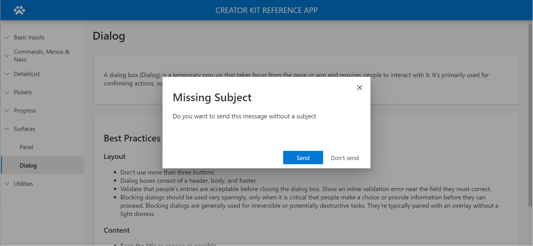
A dialog box (Dialog) is a temporary pop-up window that takes focus from the page or app and requires people to interact with it. It's primarily used for confirming actions, such as deleting a file, or asking people to make a choice.
This canvas component mimics the style and behavior of the Fluent UI Dialog control. Consult the documentation for best practices.
View the component in the Creator Kit GitHub repository.
Properties
Key properties
| Property | Description |
|---|---|
Buttons |
A dataset that defines the buttons (learn more in Button properties). |
Title |
Text displayed in the title section. |
OverlayColor |
Color displayed in the overlay area. |
DialogWidth |
The width of the dialog (not to be confused with the control width, which should span the app width). |
DialogHeight |
The height of the dialog (not to be confused with the control height, which should span the app height). |
SubTitle |
Text displayed under the title. |
Buttons properties
| Property | Description |
|---|---|
Label |
The label displayed on the button. |
ButtonType |
Enumeration that determines the styling of the button. Choose between Standard and Primary. |
Table(
    {
        Label: "Cancel",
        ButtonType:'Microsoft.CoreControls.Button.ButtonType'.Standard
    },{
        Label: "Ok",
        ButtonType:'Microsoft.CoreControls.Button.ButtonType'.Primary
    }
)
Style properties
| Property | Description |
|---|---|
Theme |
Theme object. Learn more about theming. |
Learn about formatting in the Format panel content section of Panel.
Event properties
| Property | Description |
|---|---|
OnCloseSelect |
Action expression executed when the close button is selected. |
OnButtonSelect |
Action expression executed when one of the action buttons is selected. |
Behavior
Configure Dialog visibility
Make the Dialog control itself (or the surface it's located within) visible when a Boolean (true/false) variable changes to true. Assign that variable to the dialog's visibility property. To hide the dialog after it's displayed, update the variable on the reset property triggered when the close icon is selected.
The following shows the Power Fx formula to open the dialog in an action formula on another component somewhere in the app (for example, the OnSelect property of a button):
UpdateContext({ showHideDialog: true })
The following is the Power Fx formula to close the dialog in the OnCloseSelect property of the dialog:
UpdateContext({ showHideDialog: false })
Assign the variable to the Visible property of the dialog:
showHideDialog
Configure button actions
In the OnButtonSelect property of the dialog, provide actions in an If() or Switch() condition based on the Self.SelectedButton.Label text value to define the action. Depending on the action, it might make sense to also close the dialog after the action is completed.
    If( Self.SelectedButton.Label = "Send",
        Notify("Email Sent")
    );
    UpdateContext({ showHideDialog: false })
Limitations
This canvas component can only be used in canvas apps and custom pages.