Training
Module
Customize layout in .NET MAUI XAML pages - Training
Create consistent user interfaces across different devices by using StackLayout and Grid.
This browser is no longer supported.
Upgrade to Microsoft Edge to take advantage of the latest features, security updates, and technical support.
This case study—which builds on the info given in Bookstore1—begins with a Universal 8.1 app that displays grouped data in a SemanticZoom control. In the view model, each instance of the class Author represents the group of the books written by that author, and in the SemanticZoom, we can either view the list of books grouped by author or we can zoom out to see a jump list of authors. The jump list affords much quicker navigation than scrolling through the list of books. We walk through the steps of porting the app to a Windows 10 Universal Windows Platform (UWP) app.
Note When opening Bookstore2Universal_10 in Visual Studio, if you see the message "Visual Studio update required", then follow the steps in TargetPlatformVersion.
Download the Bookstore2_81 Universal 8.1 app.
Download the Bookstore2Universal_10 Windows 10 app.
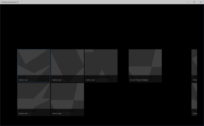
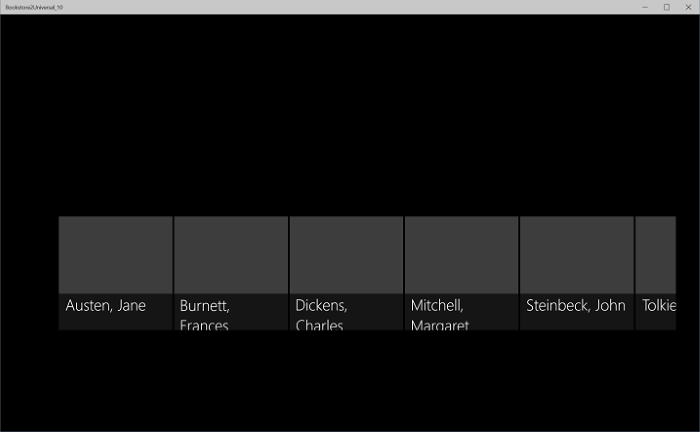
Here’s what Bookstore2_81—the app that we're going to port—looks like. It's a horizontally-scrolling (vertically-scrolling on Windows Phone) SemanticZoom showing books grouped by author. You can zoom out to the jump list and from there you can navigate back into any group. There are two main pieces to this app: the view model that provides the grouped data source, and the user interface that binds to that view model. As we'll see, both of these pieces port easily from WinRT 8.1 technology to Windows 10.
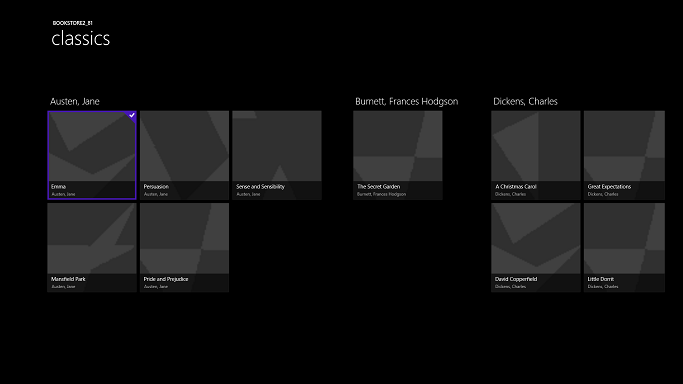
Bookstore2_81 on Windows, zoomed-in view
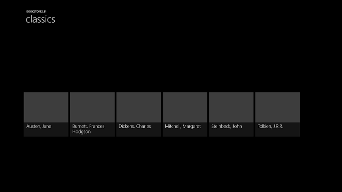
Bookstore2_81 on Windows, zoomed-out view
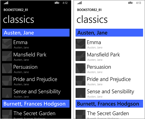
Bookstore2_81 on Windows Phone, zoomed-in view
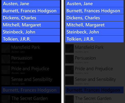
Bookstore2_81 on Windows Phone, zoomed-out view
The Bookstore2_81 solution is an 8.1 Universal App project. The Bookstore2_81.Windows project builds the app package for Windows 8.1, and the Bookstore2_81.WindowsPhone project builds the app package for Windows Phone 8.1. Bookstore2_81.Shared is the project that contains source code, markup files, and other assets and resources, that are used by both of the other two projects.
Just like with the previous case study, the option we'll take (of the ones described in If you have a Universal 8.1 app) is to port the contents of the Shared project to a Windows 10 that targets the Universal device family.
Begin by creating a new Blank Application (Windows Universal) project. Name it Bookstore2Universal_10. These are the files to copy over from Bookstore2_81 to Bookstore2Universal_10.
From the Shared project
From the Windows project
Edit the source code and markup files that you just copied and change any references to the Bookstore2_81 namespace to Bookstore2Universal_10. A quick way to do that is to use the Replace In Files feature. No code changes are needed in the view model, nor in any other imperative code. But, just to make it easier to see which version of the app is running, change the value returned by the Bookstore2Universal_10.BookstoreViewModel.AppName property from "Bookstore2_81" to "BOOKSTORE2UNIVERSAL_10".
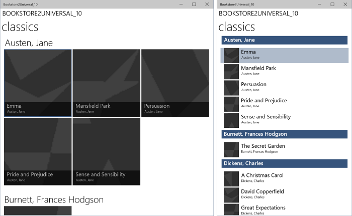
Right now, you can build and run. Here's how our new UWP app looks after having done no work yet to port it to Windows 10.
The Windows 10 app with initial source code changes running on a Desktop device, zoomed-in view
The Windows 10 app with initial source code changes running on a Desktop device, zoomed-out view
The view model and the zoomed-in and zoomed-out views are working together correctly, although there are issues that make that a little hard to see. One issue is that the SemanticZoom doesn't scroll. This is because, in Windows 10, the default style of a GridView causes it to be laid out vertically (and the Windows 10 design guidelines recommend that we use it that way in new and in ported apps). But, horizontal scrolling settings in the custom items panel template that we copied from the Bookstore2_81 project (which was designed for the 8.1 app) are in conflict with vertical scrolling settings in the Windows 10 default style that is being applied as a result of us having ported to a Windows 10 app. A second thing is that the app doesn't yet adapt its user-interface to give the best experience in different-sized windows and on small devices. And, thirdly, the correct styles and brushes are not yet being used, resulting in much of the text being invisible (including the group headers that you can click to zoom out). So, in the next three sections (SemanticZoom and GridView design changes, Adaptive UI, and Universal styling) we'll remedy those three issues.
The design changes in Windows 10 to the SemanticZoom control are described in the section SemanticZoom changes. We have no work to do in this section in response to those changes.
The changes to GridView are described in the section GridView/ListView changes. We have some very minor adjustments to make to adapt to those changes, as described below.
ZoomedInItemsPanelTemplate, set Orientation="Horizontal" and GroupPadding="0,0,0,20".ZoomedOutItemsPanelTemplate and remove the ItemsPanel attribute from the zoomed-out view.And that's it!
After that change, the UI layout that SeZoUC.xaml gives us is great for when the app is running in a wide window (which is only possible on a device with a large screen). When the app's window is narrow, though (which happens on a small device, and can also happen on a large device), the UI that we had in the Windows Phone Store app is arguably most appropriate.
We can use the adaptive Visual State Manager feature to achieve this. We'll set properties on visual elements so that, by default, the UI is laid out in the narrow state using the smaller templates that we were using in the Windows Phone Store app. Then, we'll detect when the app's window is wider-than-or-equal-to a specific size (measured in units of effective pixels), and in response, we'll change the properties of visual elements so that we get a larger, and wider, layout. We'll put those property changes in a visual state, and we'll use an adaptive trigger to continuously monitor and determine whether to apply that visual state, or not, depending on the width of the window in effective pixels. We're triggering on window width in this case, but it's possible to trigger on window height, too.
A minimum window width of 548 epx is appropriate for this use case because that's the size of the smallest device we would want to show the wide layout on. Phones are typically smaller than 548 epx so on a small device like that we'd remain in the default narrow layout. On a PC, the window will launch by default wide enough to trigger the switch to the wide state. From there, you'll be able to drag the window narrow enough to display two columns of the 250x250-sized items. A little narrower than that and the trigger will deactivate, the wide visual state will be removed, and the default narrow layout will be in effect.
So, what properties do we need to set—and change—to achieve these two different layouts? There are two alternatives and each entails a different approach.
In this case study, we're going to go with the first alternative. But, if you like, you can try the second one and see if that works better for you. Here are the steps to take to implement that first alternative.
x:Name="wideSeZo" and Visibility="Collapsed".wideSeZo in your new project. Set x:Name="narrowSeZo" on element that you just pasted.narrowSeZo needs a couple of styles that we haven't copied yet. Again in Bookstore2_81.WindowsPhone, copy the two styles (AuthorGroupHeaderContainerStyle and ZoomedOutAuthorItemContainerStyle) out of SeZoUC.xaml and paste them into BookstoreStyles.xaml in your new project.Wide to these three resource keys (and to their references in SeZoUC.xaml, but only to the references inside wideSeZo): AuthorGroupHeaderTemplate, ZoomedOutAuthorTemplate, and BookTemplate. <Grid>
<VisualStateManager.VisualStateGroups>
<VisualStateGroup>
<VisualState x:Name="WideState">
<VisualState.StateTriggers>
<AdaptiveTrigger MinWindowWidth="548"/>
</VisualState.StateTriggers>
<VisualState.Setters>
<Setter Target="wideSeZo.Visibility" Value="Visible"/>
<Setter Target="narrowSeZo.Visibility" Value="Collapsed"/>
</VisualState.Setters>
</VisualState>
</VisualStateGroup>
</VisualStateManager.VisualStateGroups>
...
</Grid>
Now, let's fix up some styling issues, including one that we introduced above while copying from the old project.
LayoutRoot's Background to "{ThemeResource ApplicationPageBackgroundThemeBrush}".TitlePanelMargin to 0 (or whatever value looks good to you).wideSeZo to 0 (or whatever value looks good to you).AuthorGroupHeaderTemplateWide.AuthorGroupHeaderTemplate and from ZoomedOutAuthorTemplate.BookTemplateTitleTextBlockStyle, BookTemplateAuthorTextBlockStyle, and PageTitleTextBlockStyle resource keys as an indirection so that a single key had different implementations in the two apps. We don't need that indirection any more; we can just reference system styles directly. So, replace those references throughout the app with TitleTextBlockStyle, CaptionTextBlockStyle, and HeaderTextBlockStyle respectively. You can use the Visual Studio Replace In Files feature to do this quickly and accurately. You can then delete those three unused resources.AuthorGroupHeaderTemplate, replace PhoneAccentBrush with SystemControlBackgroundAccentBrush, and set Foreground="White" on the TextBlock so that it looks correct when running on the mobile device family.BookTemplateWide, copy the Foreground attribute from the second TextBlock to the first.ZoomedOutAuthorTemplateWide, change the reference to SubheaderTextBlockStyle (which is now a little too big) to a reference to SubtitleTextBlockStyle.Background attribute from the zoomed-out view of narrowSeZo.ZoomedInItemsPanelTemplate out of SeZoUC.xaml and into BookstoreStyles.xaml.That last sequence of styling operations leaves the app looking like this.
The ported Windows 10 app running on a Desktop device, zoomed-in view, two sizes of window
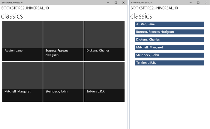
The ported Windows 10 app running on a Desktop device, zoomed-out view, two sizes of window
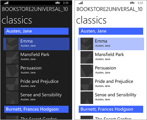
The ported Windows 10 app running on a Mobile device, zoomed-in view
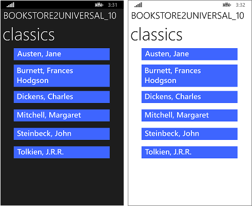
The ported Windows 10 app running on a Mobile device, zoomed-out view
This case study involved a more ambitious user interface than the previous one. As with the previous case study, this particular view model required no work at all, and our efforts went primarily into refactoring the user interface. Some of the changes were a necessary result of combining two projects into one while still supporting many form factors (in fact, many more than we could before). A few of the changes were to do with changes that have been made to the platform.
The next case study is QuizGame, in which we look at accessing and displaying grouped data.
Training
Module
Customize layout in .NET MAUI XAML pages - Training
Create consistent user interfaces across different devices by using StackLayout and Grid.