Note
Access to this page requires authorization. You can try signing in or changing directories.
Access to this page requires authorization. You can try changing directories.
This article describes how to apply Mica as the base layer of your UWP app using WinUI 2, prioritizing application and visibility in the title bar area. For more information about app layering with Mica, see Mica material.
Mica is an opaque material that incorporates the user's theme and desktop wallpaper to create a highly personalized appearance. As the user moves the window across the screen, the Mica material dynamically adapts to create a rich visualization using the wallpaper underneath the application. In addition, the material helps users focus on the current task by falling back to a neutral color when the app is inactive.
Mica is available for UWP apps that use WinUI 2 while running on Windows 11 version 22000 or later. On Windows 10, the background falls back to a solid color.
Prerequisites
- The WinUI 2 NuGet package (see Get started with WinUI 2)
- Familiarity with Mica material.
- Familiarity with Title bar customization
Use Mica with WinUI 2 for UWP
Important APIs: BackdropMaterial class
To apply Mica in a UWP app, you use the BackdropMaterial class from WinUI 2. We recommend that you set the BackdropMaterial.ApplyToRootOrPageBackground attached property on a XAML element that is the root of your XAML content, as it will apply to the entire content region (such as a Window). If your app has a Frame that navigates multiple pages, you should set this property on the Frame. Otherwise, you should set this property on the main Page of your app.
xmlns:muxc="using:Microsoft.UI.Xaml.Controls"

<Page muxc:BackdropMaterial.ApplyToRootOrPageBackground="True">
    <TextBlock>Hello world</TextBlock>
</Page>
The following examples show how to implement the standard layering patterns shown in the Mica material overview. Each of these examples use and require the same title bar code-behind, which is shown in the last example.
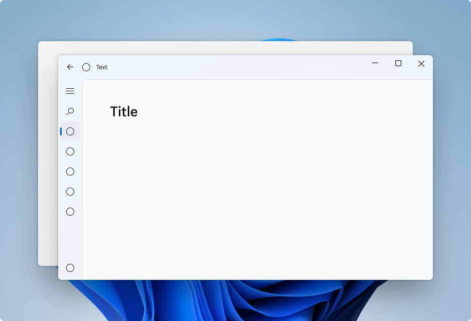
Example: Standard pattern in Left NavigationView
By default, NavigationView in Left mode includes the content layer in its content area. This example extends Mica into the title bar area and creates a custom title bar.
<Page
    x:Class="LeftNavView.MainPage"
    xmlns="http://schemas.microsoft.com/winfx/2006/xaml/presentation"
    xmlns:x="http://schemas.microsoft.com/winfx/2006/xaml"
    xmlns:local="using:LeftNavView"
    xmlns:d="http://schemas.microsoft.com/expression/blend/2008"
    xmlns:mc="http://schemas.openxmlformats.org/markup-compatibility/2006"
    xmlns:muxc="using:Microsoft.UI.Xaml.Controls"
    mc:Ignorable="d"
    muxc:BackdropMaterial.ApplyToRootOrPageBackground="True">
    <Page.Resources>
        <!--This top margin is the height of the custom TitleBar-->
        <Thickness x:Key="NavigationViewContentMargin">0,48,0,0</Thickness>
    </Page.Resources>
    <Grid>
        <Border x:Name="AppTitleBar"
                IsHitTestVisible="True"
                VerticalAlignment="Top"
                Background="Transparent"
                Height="48"
                Canvas.ZIndex="1"
                Margin="48,0,0,0">
            <StackPanel Orientation="Horizontal">
                <Image x:Name="AppFontIcon"
                    HorizontalAlignment="Left"
                    VerticalAlignment="Center"
                    Source="Assets/Square44x44Logo.png"
                    Width="16"
                    Height="16"/>
                <TextBlock x:Name="AppTitle"
                    Text="Test App Title"
                    VerticalAlignment="Center"
                    Margin="12, 0, 0, 0"
                    Style="{StaticResource CaptionTextBlockStyle}" />
            </StackPanel>
        </Border>
        <muxc:NavigationView x:Name="NavigationViewControl"
            IsTitleBarAutoPaddingEnabled="False"
            IsBackButtonVisible="Visible"
            Header="Title"
            DisplayModeChanged="NavigationViewControl_DisplayModeChanged"
            Canvas.ZIndex="0">
            <muxc:NavigationView.MenuItems>
                <muxc:NavigationViewItem Icon="Target" Content="Text"/>
                <muxc:NavigationViewItem Icon="Target" Content="Text"/>
                <muxc:NavigationViewItem Icon="Target" Content="Text"/>
                <muxc:NavigationViewItem Icon="Target" Content="Text"/>
                <muxc:NavigationViewItem Icon="Target" Content="Text"/>
            </muxc:NavigationView.MenuItems>
            <Grid>
                <Frame x:Name="contentFrame">
                    <Grid>
                        <TextBlock Padding="56,16,0,0">Page content!</TextBlock>
                    </Grid>
                </Frame>
            </Grid>
        </muxc:NavigationView>
    </Grid>
</Page>
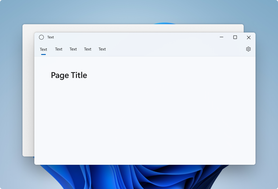
Example: Standard pattern in Top NavigationView
By default, NavigationView in Top mode includes the content layer in its content area. This example extends Mica into the title bar area and creates a custom title bar.
<Page
    x:Class="TopNavView.MainPage"
    xmlns="http://schemas.microsoft.com/winfx/2006/xaml/presentation"
    xmlns:x="http://schemas.microsoft.com/winfx/2006/xaml"
    xmlns:local="using:TopNavView"
    xmlns:d="http://schemas.microsoft.com/expression/blend/2008"
    xmlns:mc="http://schemas.openxmlformats.org/markup-compatibility/2006"
    xmlns:muxc="using:Microsoft.UI.Xaml.Controls"
    mc:Ignorable="d"
    muxc:BackdropMaterial.ApplyToRootOrPageBackground="True">
    <Page.Resources>
        <CornerRadius x:Key="NavigationViewContentGridCornerRadius">0</CornerRadius>
    </Page.Resources>
    <Grid>
        <Border x:Name="AppTitleBar"
                IsHitTestVisible="True"
                VerticalAlignment="Top"
                Background="Transparent"
                Height="32"
                Margin="48,0,0,0">
            <StackPanel Orientation="Horizontal">
                <Image x:Name="AppFontIcon"
                    HorizontalAlignment="Left"
                    VerticalAlignment="Center"
                    Source="Assets/Square44x44Logo.png"
                    Width="16"
                    Height="16"/>
                <TextBlock x:Name="AppTitle"
                    Text="Test App Title"
                    VerticalAlignment="Center"
                    Margin="12,0,0,0"
                    Style="{StaticResource CaptionTextBlockStyle}" />
            </StackPanel>
        </Border>
            <muxc:NavigationView x:Name="NavigationViewControl"
            Header="Page Title"
            DisplayModeChanged="NavigationViewControl_DisplayModeChanged"
            PaneDisplayMode="Top">
                <muxc:NavigationView.MenuItems>
                    <muxc:NavigationViewItem Content="Text"/>
                    <muxc:NavigationViewItem Content="Text"/>
                    <muxc:NavigationViewItem Content="Text"/>
                    <muxc:NavigationViewItem Content="Text"/>
                    <muxc:NavigationViewItem Content="Text"/>
            </muxc:NavigationView.MenuItems>
                <Grid>
                    <Frame x:Name="contentFrame">
                        <Grid>
                            <TextBlock Padding="56,16,0,0">Page content!</TextBlock>
                        </Grid>
                    </Frame>
                </Grid>
            </muxc:NavigationView>
    </Grid>
</Page>
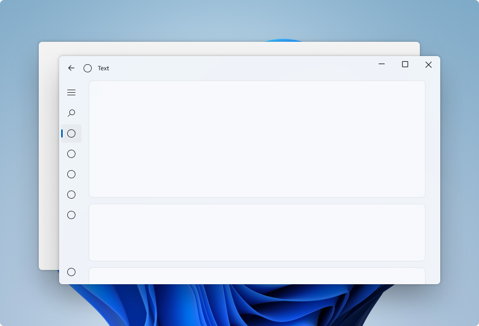
Example: Card pattern in Left NavigationView
To follow the card pattern using a NavigationView you will need to remove the default content layer by overriding the background and border theme resources. Then, you can create the cards in the content area of the control. This example creates several cards, extends Mica into the title bar area, and creates a custom title bar. For more information on card UI, see Layering and Elevation guidance.
<Page
    x:Class="CardLayout.MainPage"
    xmlns="http://schemas.microsoft.com/winfx/2006/xaml/presentation"
    xmlns:x="http://schemas.microsoft.com/winfx/2006/xaml"
    xmlns:local="using:CardLayout"
    xmlns:d="http://schemas.microsoft.com/expression/blend/2008"
    xmlns:mc="http://schemas.openxmlformats.org/markup-compatibility/2006"
    xmlns:muxc="using:Microsoft.UI.Xaml.Controls"
    mc:Ignorable="d"
    muxc:BackdropMaterial.ApplyToRootOrPageBackground="True">
    <Page.Resources>
        <!--This top margin is the height of the custom TitleBar-->
        <Thickness x:Key="NavigationViewContentMargin">0,48,0,0</Thickness>
        <Thickness x:Key="NavigationViewContentGridBorderThickness">0</Thickness>
        <SolidColorBrush x:Key="NavigationViewContentBackground" Color="Transparent"></SolidColorBrush>
    </Page.Resources>

    <Grid>
        <Border x:Name="AppTitleBar"
                IsHitTestVisible="True"
                VerticalAlignment="Top"
                Background="Transparent"
                Height="48"
                Canvas.ZIndex="1"
                Margin="48,0,0,0">
            <StackPanel Orientation="Horizontal">
                <Image x:Name="AppFontIcon"
                    HorizontalAlignment="Left"
                    VerticalAlignment="Center"
                    Source="Assets/Square44x44Logo.png"
                    Width="16"
                    Height="16"/>
                <TextBlock x:Name="AppTitle"
                    Text="Test App Title"
                    VerticalAlignment="Center"
                    Margin="12,0,0,0"
                    Style="{StaticResource CaptionTextBlockStyle}" />
            </StackPanel>
        </Border>

        <muxc:NavigationView x:Name="NavigationViewControl"
            IsTitleBarAutoPaddingEnabled="False"
            IsBackButtonVisible="Visible"
            Header="Title"
            DisplayModeChanged="NavigationViewControl_DisplayModeChanged"
            Canvas.ZIndex="0">
            <muxc:NavigationView.MenuItems>
                <muxc:NavigationViewItem Icon="Target" Content="Text"/>
                <muxc:NavigationViewItem Icon="Target" Content="Text"/>
                <muxc:NavigationViewItem Icon="Target" Content="Text"/>
                <muxc:NavigationViewItem Icon="Target" Content="Text"/>
                <muxc:NavigationViewItem Icon="Target" Content="Text"/>
            </muxc:NavigationView.MenuItems>
            <Grid>
                <Frame x:Name="contentFrame">
                    <StackPanel Orientation="Vertical" Margin="40,16,0,0">
                        <Border Width="600" Height="200" Background="{ThemeResource LayerFillColorDefaultBrush}"
                                VerticalAlignment="Top"
                                HorizontalAlignment="Left"
                                Margin="16"
                                CornerRadius="8"
                                BorderThickness="1"
                                BorderBrush="{ThemeResource CardStrokeColorDefaultBrush}">
                            <TextBlock VerticalAlignment="Center" HorizontalAlignment="Center">Content here!</TextBlock>
                        </Border>
                    </StackPanel>
                </Frame>
            </Grid>
        </muxc:NavigationView>
    </Grid>
</Page>
Title bar code-behind
The previous three app layout XAML pages use this code-behind to create a custom title bar adaptive to app state and visibility.
For more information see Title bar customization.
public MainPage()
{
    this.InitializeComponent();
    var titleBar = ApplicationView.GetForCurrentView().TitleBar;

    titleBar.ButtonBackgroundColor = Colors.Transparent;
    titleBar.ButtonInactiveBackgroundColor = Colors.Transparent;

    // Hide default title bar.
    var coreTitleBar = CoreApplication.GetCurrentView().TitleBar;
    coreTitleBar.ExtendViewIntoTitleBar = true;
    UpdateTitleBarLayout(coreTitleBar);

    // Set XAML element as a draggable region.
    Window.Current.SetTitleBar(AppTitleBar);

    // Register a handler for when the size of the overlaid caption control changes.
    // For example, when the app moves to a screen with a different DPI.
    coreTitleBar.LayoutMetricsChanged += CoreTitleBar_LayoutMetricsChanged;

    // Register a handler for when the title bar visibility changes.
    // For example, when the title bar is invoked in full screen mode.
    coreTitleBar.IsVisibleChanged += CoreTitleBar_IsVisibleChanged;

    //Register a handler for when the window changes focus
    Window.Current.Activated += Current_Activated;
}

private void CoreTitleBar_LayoutMetricsChanged(CoreApplicationViewTitleBar sender, object args)
{
    UpdateTitleBarLayout(sender);
}

private void UpdateTitleBarLayout(CoreApplicationViewTitleBar coreTitleBar)
{
    // Update title bar control size as needed to account for system size changes.
    AppTitleBar.Height = coreTitleBar.Height;

    // Ensure the custom title bar does not overlap window caption controls
    Thickness currMargin = AppTitleBar.Margin;
    AppTitleBar.Margin = new Thickness(currMargin.Left, currMargin.Top, coreTitleBar.SystemOverlayRightInset, currMargin.Bottom);
}

private void CoreTitleBar_IsVisibleChanged(CoreApplicationViewTitleBar sender, object args)
{
    if (sender.IsVisible)
    {
        AppTitleBar.Visibility = Visibility.Visible;
    }
    else
    {
        AppTitleBar.Visibility = Visibility.Collapsed;
    }
}

// Update the TitleBar based on the inactive/active state of the app
private void Current_Activated(object sender, Windows.UI.Core.WindowActivatedEventArgs e)
{
    SolidColorBrush defaultForegroundBrush = (SolidColorBrush)Application.Current.Resources["TextFillColorPrimaryBrush"];
    SolidColorBrush inactiveForegroundBrush = (SolidColorBrush)Application.Current.Resources["TextFillColorDisabledBrush"];

    if (e.WindowActivationState == Windows.UI.Core.CoreWindowActivationState.Deactivated)
    {
        AppTitle.Foreground = inactiveForegroundBrush;
    }
    else
    {
        AppTitle.Foreground = defaultForegroundBrush;
    }
}

// Update the TitleBar content layout depending on NavigationView DisplayMode
private void NavigationViewControl_DisplayModeChanged(Microsoft.UI.Xaml.Controls.NavigationView sender, Microsoft.UI.Xaml.Controls.NavigationViewDisplayModeChangedEventArgs args)
{
    const int topIndent = 16;
    const int expandedIndent = 48;
    int minimalIndent = 104;

    // If the back button is not visible, reduce the TitleBar content indent.
    if (NavigationViewControl.IsBackButtonVisible.Equals(Microsoft.UI.Xaml.Controls.NavigationViewBackButtonVisible.Collapsed))
    {
        minimalIndent = 48;
    }

    Thickness currMargin = AppTitleBar.Margin;

    // Set the TitleBar margin dependent on NavigationView display mode
    if (sender.PaneDisplayMode == Microsoft.UI.Xaml.Controls.NavigationViewPaneDisplayMode.Top)
    {
        AppTitleBar.Margin = new Thickness(topIndent, currMargin.Top, currMargin.Right, currMargin.Bottom);
    }
    else if (sender.DisplayMode == Microsoft.UI.Xaml.Controls.NavigationViewDisplayMode.Minimal)
    {
        AppTitleBar.Margin = new Thickness(minimalIndent, currMargin.Top, currMargin.Right, currMargin.Bottom);
    }
    else
    {
        AppTitleBar.Margin = new Thickness(expandedIndent, currMargin.Top, currMargin.Right, currMargin.Bottom);
    }
}