Note
Access to this page requires authorization. You can try signing in or changing directories.
Access to this page requires authorization. You can try changing directories.
Important
The Read-only Grid control is deprecated. Use the Power Apps grid control instead. More information: Deprecation of Editable Grid and Power Apps Read-Only Grid controls
The Power Apps read-only grid control lets users view and open records from views and subgrids. The control supports the latest Microsoft accessibility standards and is built to be performant and easily extensible for the future. The Power Apps read-only grid control also aligns with the latest Microsoft design guidance for fonts, sizing, and styling.
Note
As of April 2022, the Power Apps read-only grid control is the default control for all read-only views and subgrids.
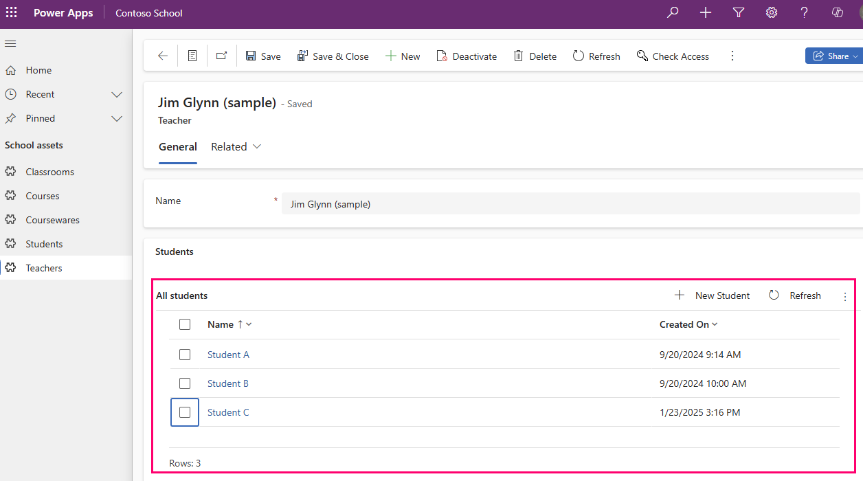
Add the Power Apps read-only grid as a subgrid on a form
When you add a subgrid to a form, the subgrid only appears on that form and not other forms or views.
More information: Add and configure a subgrid component on a form
Add the Power Apps read-only grid control to views for a table
When you configure the Power Apps read-only grid control for a table, all views for that table display using that grid.
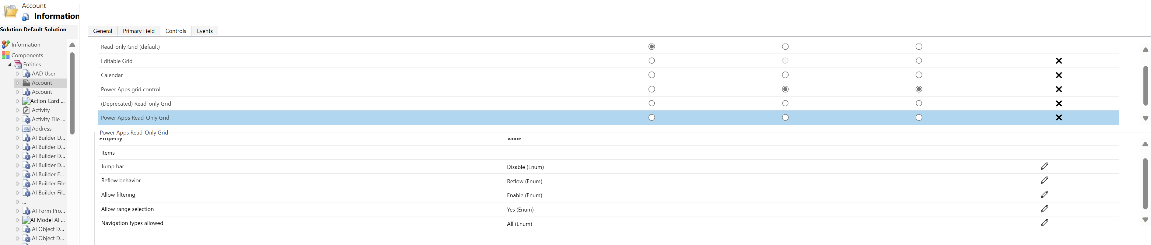
- Open solution explorer.
- Expand Entities, in the list of tables, open the table you want, select the Controls tab, and then select Add Control.
- In the Add Control dialog box, select Power Apps Read-only Grid, and then select Add.
Configure the Power Apps read-only grid control
In the Power Apps Read-Only Grid row, select the app types you want to apply the grid to. This selection makes the control the default control for the selected clients.
Select the pencil icon next to the following properties to make the changes you want:
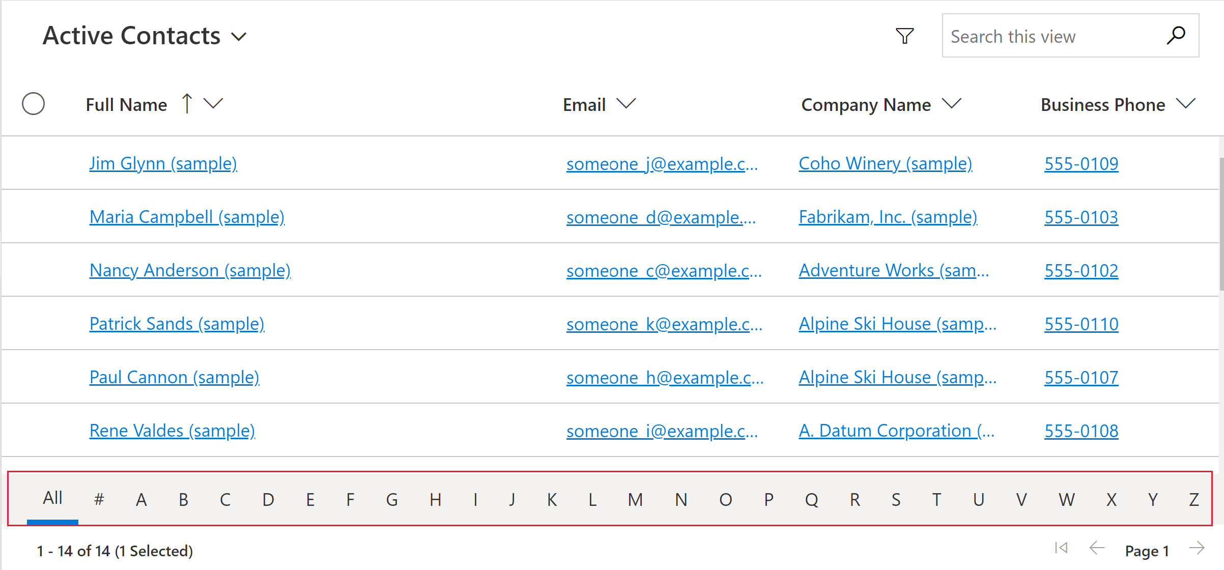
- Jump bar: By default, the jump bar is disabled. To display an alphabetic list at the bottom of views or subgrids (the jump bar), select the pencil icon in the Jump bar row. Under Bind to static options, select Enable in the dropdown list. Below is a screenshot of the jump bar enabled for the contact table in a model-driven app.
- Reflow behavior: Use this parameter to specify when the grid reflows into a list format or a grid format. Reflowing the control into a list is often better suited for small displays such as a mobile device. The default value is Reflow.
- Reflow: Allows the grid to render into list mode when there’s not enough display space.
- Grid only: Displays only as a grid even on smaller displays such as a mobile device.
- List only: Displays only as a list even when there's enough space to display as grid.
- Allow filtering: Determines whether filtering options are available to users in the grid column header dropdowns. The default value is Enable.
- Enable: Filtering options are available to users.
- Disable: Filtering options aren’t available to users.
- Allow range selection: Controls whether users can select a subset of the grid and copy that data to another application like Excel. The default value is Yes.
- Yes: Users can select and copy data from the grid.
- No: Users can’t select and copy data from the grid.
- Navigation types allowed: Determines which lookup controls in the grid render as hyperlinks. The default value is All.
- All: All table lookup columns render in the grid as a hyperlink.
- Primary only: Suppresses hyperlinks on all lookup fields except the primary column for the selected table.
- Jump bar: By default, the jump bar is disabled. To display an alphabetic list at the bottom of views or subgrids (the jump bar), select the pencil icon in the Jump bar row. Under Bind to static options, select Enable in the dropdown list. Below is a screenshot of the jump bar enabled for the contact table in a model-driven app.
To save your changes, select Save on the command bar. When you're ready to make the changes available to app users, select Publish on the command bar.

Add the Power Apps read-only grid control to a subgrid
- Open solution explorer.
- Open the form that contains the subgrid.
- Select the subgrid where you want to configure this grid, and then select Change Properties on the command bar.
- In the Set Properties dialog box, select the Controls tab, select Add Control, and then select Power Apps Read-only Grid.
- To continue with configuring and publishing the control, see Configure the Power Apps read-only grid control.
Opt out of the Power Apps read-only grid control
While the Power Apps read-only grid control became the default grid experience in April 2022, you can opt your organization out of the automatic switch to this grid by following the steps here.
- Go to the Power Platform Admin Center Manage > Environments. Select Settings on the command bar, and then select Product > Features.
- Turn off the Enable the modern read-only grid experience option in the Grids and views section.
Note
As the legacy read-only grid is deprecated, this toggle to opt out of the automatic switch to the Power Apps read-only grid is eventually be removed.
Known issues and limitations
Grid rendering performance
In general, grid performance can be increased by limiting the number of records fetched at once and limiting the number of columns in a view.
If the page size is sufficiently large, the grid might take a long time to render. The current recommendation is to ensure the page size isn't too large, ideally no more than 25 rows.
UI limitations and differences
- The grid doesn't currently support any theme customizations
- Cells with no data are blank instead of displaying three dashes ---.
- The owner column doesn't show online status and a people card for the user.
- Reordering columns from the grid column headers isn't supported.
- If the dataset displayed in the grid contains duplicate rows, the duplicates might not display in the grid. This can lead to the reported record count showing more records than are actually in the grid, or more records appearing when exporting the data to Excel or viewing the data in legacy Advanced Find. This behavior applies to all grid controls, not just the Power Apps read-only grid.
Limitations with card form lists
When a view or subgrid is narrow, it changes into a card list format that is better for small screens, such as mobile devices. The Power Apps read-only grid control displays the following behavior in a card list:
- Sort isn't currently available in a card list view. To work around this, create views with the sort order you want.
- Select all and Clear all aren't available in a card list view.
- The jump bar isn't available in a card list view. To work around this, select Search to filter records. Type the desired letter, and then press Enter.
- Images on a record in the list don't display in a card list view. This includes table icons, web resource images, custom images, and conditional images. The only image displayed for a record in the list are the initials of the record.
- There are no icons for context menu commands in a card list view.
- When there are no records, some lists have a prompt to create a new item. This button isn't displayed in a card list view that uses the Power Apps read-only grid control.
The list view doesn’t display custom cards for the table
To work around this issue, display a custom card by configuring the table to use the card form of the legacy read-only grid control.
Go to Power Apps (make.powerapps.com) > Settings > Advanced Settings > Settings > Customizations > Customize the System > expand Entities > select the entity you want to customize > Controls tab > Add Control.
Select Read Only Grid, and then select Add. Choose to display that grid on one or more client form factors.
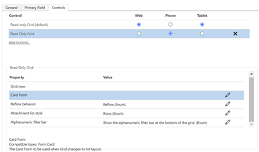
Select Configure property (pencil icon) for the Card Form property, and select the custom card form from the drop-down list.
Select OK, and then Publish the customization.