使用 Power BI 分析 Azure Data Lake Storage Gen2 中的數據
在本文中,您將瞭解如何使用 Power BI Desktop 來分析和可視化儲存在具有階層命名空間的記憶體帳戶中的數據(Azure Data Lake Storage Gen2)。
開始進行本教學課程之前,您必須具備下列必要條件:
- Azure 訂用帳戶。 請移至取得 Azure 免費試用。
- 具有階層命名空間的記憶體帳戶。 請遵循建立記憶體帳戶以 建立記憶體帳戶中的指示來建立記憶體帳戶 。 本文假設您已建立名為的
contosoadlscdm記憶體帳戶。 - 請確定您已獲授與記憶體帳戶的下列其中一個角色: Blob 數據讀取器、 Blob 數據參與者或 Blob 數據擁有者。
- 名為
Drivers.txt的範例數據檔,位於您的記憶體帳戶中。 您可以從 Azure Data Lake Git 存放庫下載此範例,然後將該檔案上傳至您的記憶體帳戶。 - Power BI Desktop。 您可以從 Microsoft 下載中心下載此應用程式。
在您的電腦上啟動 Power BI Desktop。
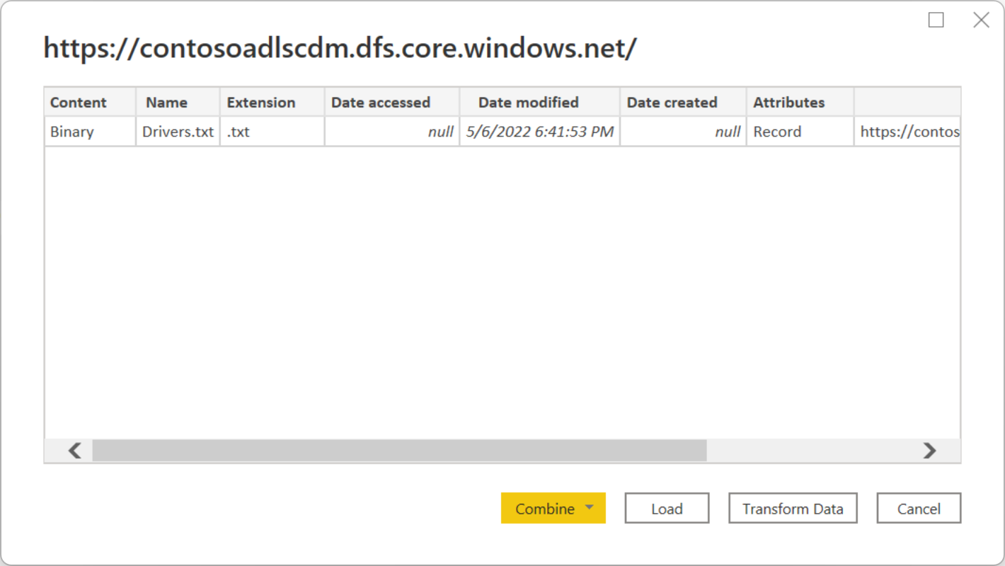
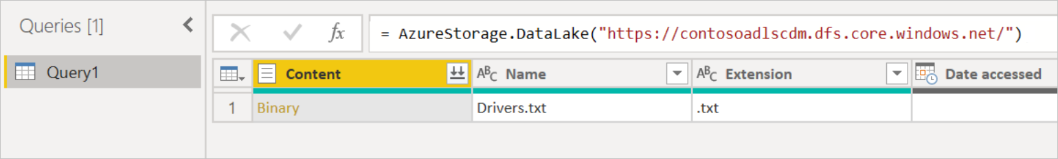
請遵循 Azure Data Lake Storage Gen2 連接器文章中的指示,連線到範例數據。
從 Power Query Navigator 中,選取 [ 載入]。
成功將數據載入 Power BI 之後,下列欄位會顯示在 [ 字段 ] 面板中。
![[欄位] 面板的螢幕快照,其中顯示 Query1,其中包含 [已存取日期]、[建立日期]、[修改日期]、[延伸模組]、[資料夾路徑] 和 [名稱] 字段。](media/data-lake-storage/fields.png)
不過,若要可視化和分析數據,您可能會偏好使用下列字段來取得數據。
![數據表的螢幕快照,其中含有數據列中所顯示原始數據表中 [內容] 資料行的名稱和位址。](media/data-lake-storage/preferred-fields.png)
在下一個步驟中,您將更新查詢,將匯入的數據轉換成所需的格式。
從功能區的 [ 首頁] 索引標籤中,選取 [ 轉換數據]。 然後,Power Query 編輯器隨即開啟,顯示檔案的內容。
在 Power Query 編輯器的 [內容] 資料行底下,選取 [二進位]。 檔案會自動偵測為 CSV,且將包含輸出,如下所示。 您的資料現在為可用來建立視覺效果的格式。
![Power Query 編輯器的螢幕快照,其中顯示 [二進位] 字段的數據已展開至具有名稱和地址的數據表,並將 [匯入的 CSV] 和 [已變更類型] 新增至 [套用的步驟] 面板。](media/data-lake-storage/binary.png)
從功能區的 [ 首頁] 索引標籤中,選取 [ 關閉及套用]。
![Power Query 編輯器的關閉螢幕快照,其中顯示 [關閉與套用] 選項。](media/data-lake-storage/close-apply.png)
更新查詢之後,[ 欄位 ] 索引標籤會顯示視覺效果可用的新欄位。
![Power BI 中 [字段] 窗格的螢幕快照,其中 Query1 現在會顯示 Column1 到 Column8。](media/data-lake-storage/new-fields.png)
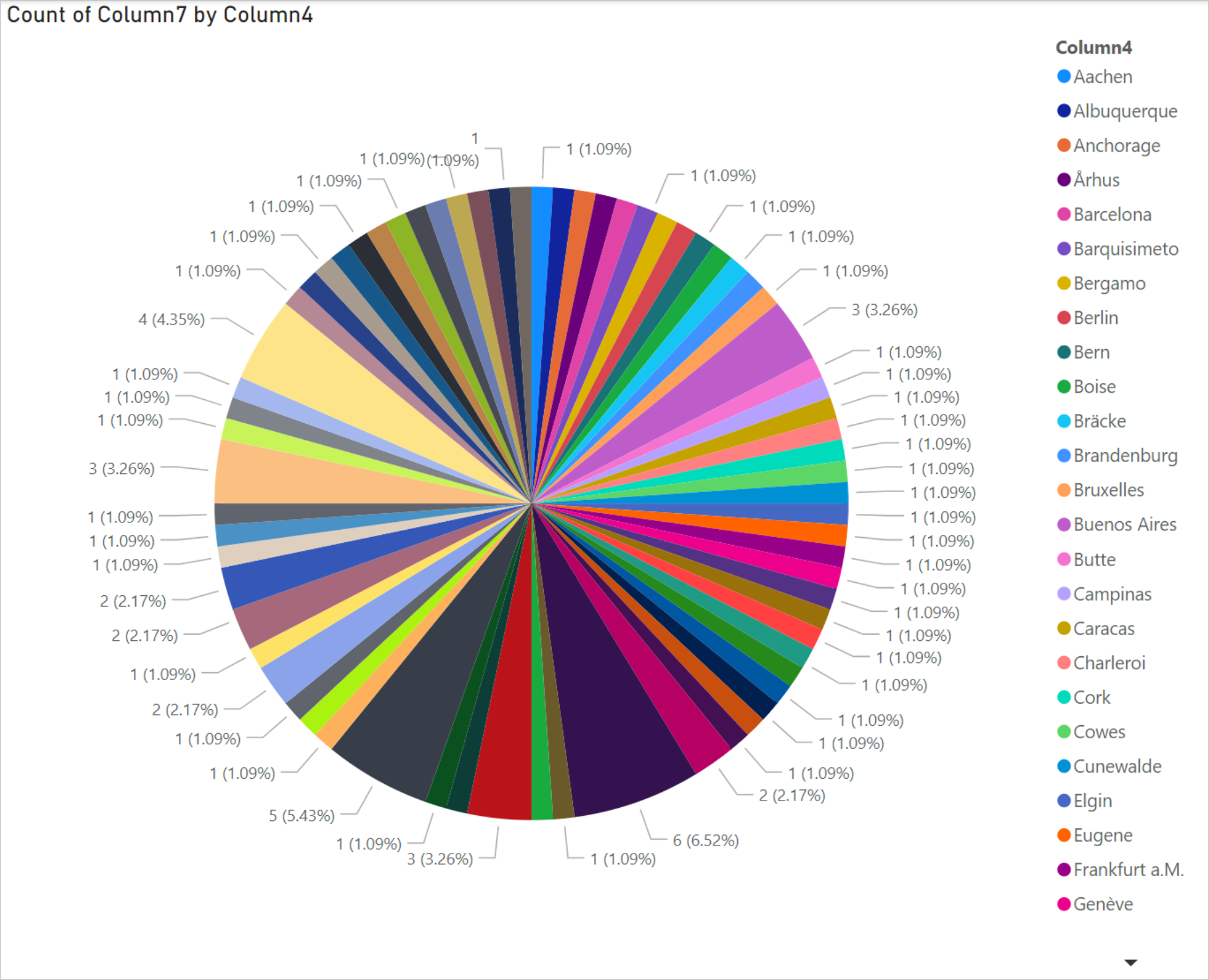
現在,您可以建立餅圖來代表指定國家/地區的每個城市中的驅動程式。 若要這麼做,請進行下列選擇。
從 [ 視覺效果] 索引 標籤中,選取餅圖的符號。
![[視覺效果] 窗格的螢幕快照,其中強調餅圖符號。](media/data-lake-storage/visualizations.png)
在此範例中,您要使用的數據行為 Column 4(城市名稱)和數據行 7(國家/地區的名稱)。 將這些數據行從 [ 字段 ] 索引卷標拖曳到 [ 視覺效果] 索引標籤, 如下所示。
![在 [詳細數據] 中拖放 Column4 的螢幕快照,並將 Column7 拖放到 [視覺效果] 窗格中的 [值] 中,而 Column7 也會拖曳並放入 [篩選] 窗格中此頁面的 [篩選]。](media/data-lake-storage/visualizations-drag-fields.png)
餅圖現在應該類似下面所示的餅圖。
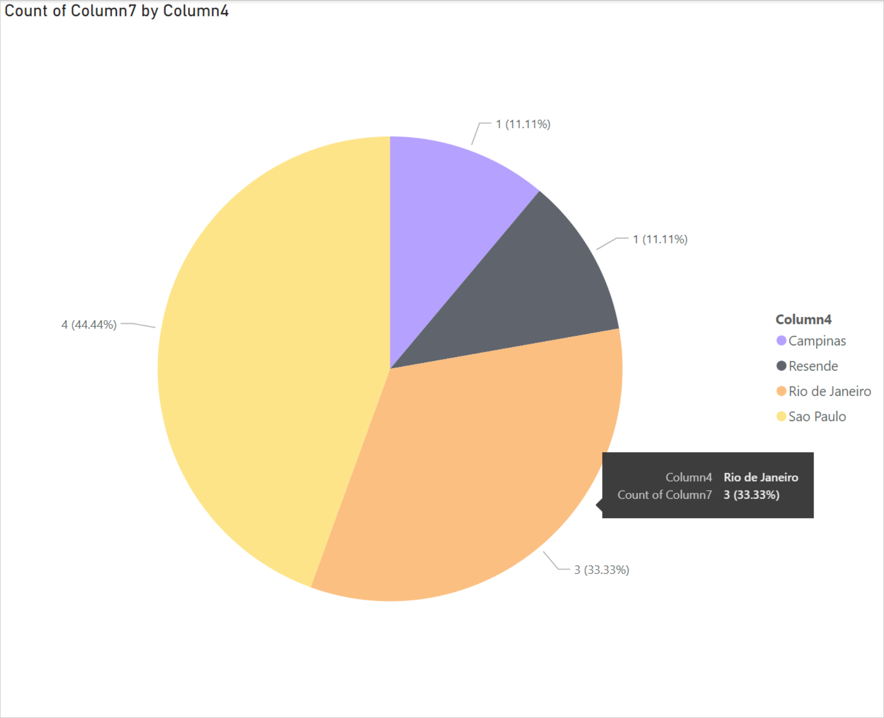
如果您從頁面層級篩選選取特定國家/地區,則會顯示所選國家/地區每個城市中的驅動程序數目。 例如,在 [視覺效果] 索引標籤的 [頁面層級篩選] 下,選取 [巴西]。
![此頁面窗格的 [篩選] 螢幕快照,其中已選取巴西作為要顯示的國家/地區。](media/data-lake-storage/page-filters.png)
圓形圖會自動更新以顯示巴西城市中的驅動程式。
從 [ 檔案 ] 功能表中,選取 [ 儲存 ] 以將視覺效果儲存為 Power BI Desktop 檔案。


![Power Query 編輯器的螢幕快照,其中顯示 [二進位] 字段的數據已展開至具有名稱和地址的數據表,並將 [匯入的 CSV] 和 [已變更類型] 新增至 [套用的步驟] 面板。](media/data-lake-storage/binary.png#lightbox)
在 Power BI Desktop 中建立視覺效果之後,您可以將視覺效果發佈至 Power BI 服務,與其他人共用視覺效果。 如需如何執行此動作的指示,請移至 從 Power BI Desktop 發佈。
- Azure Data Lake Storage Gen2 \(部分機器翻譯\)